Is your website inviting enough for them to want to take off their coat and stay awhile? If people aren't spending much time on yours take the steps in the following we created below to improve things.
Add internal links
While you want your website copy to be easily digestible, you also want it to be highly informative. Aware that conveying a lot of value in just a few sentences can feel like trying to fit two mismatched puzzle pieces together, linking to clarifying content aims to make it easier.
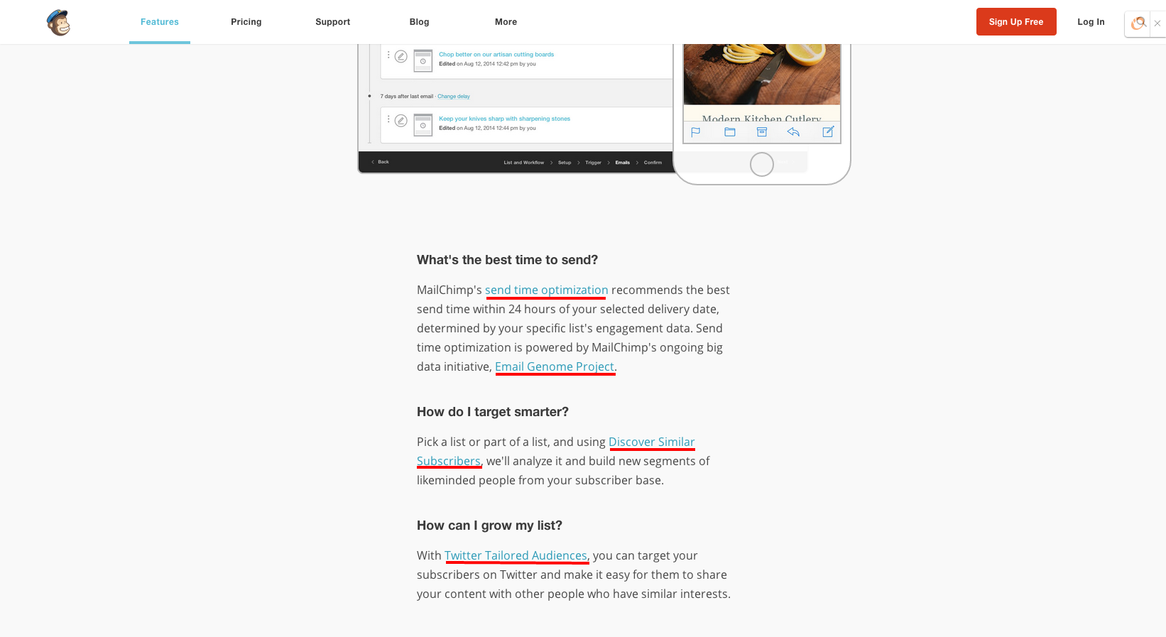
Take a look at how MailChimp leverages links to their blog content to deliver information-packed content without dragging it out:

Create space to let your content breathe
However, background-color: #fff; is not a cure-all for all bounce-rate woes. Changing the backdrop alone won’t do much good if the rest of your content looks like a group of clowns inside a car.
With that in mind, it might be a good idea to crank up the margins and paddings around your content. One of my favorite examples for this is the Genesis Framework. It looks clean, uncluttered and is a real feast for the eyes (yes, I'm a fan and a customer).
The need for speed
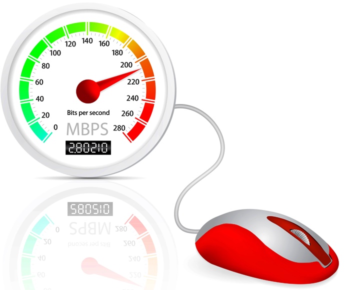
According to research by Radware, the median time for a page to load content is 4.9 seconds. While Google reports that web page load times have improved, Web Performance Today found just the opposite. Images can be a culprit, contributing to large page sizes and slower load times. To avoid image overload, make sure your images are compressed and correctly formatted. Video, too, can be a problem – that’s why it’s usually better to host the video on another site/server.

Experiment with multimedia
Multimedia files tend to hold viewers' attention for longer. Your visitors might not sit down and read 2,000 word articles, but they may listen to all of the same content in a single visit if it's conveyed via video or audio.
Try experimenting with everything from embedded video clips to slideshow presentations to podcasts to image galleries. Measure the impact of these additions on your site's "stickiness" metrics to determine which techniques to use again.
Put your best stuff “above the fold”
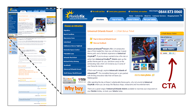
“Above the fold” means anything that a visitor sees on their screen without having to scroll down or click. Let’s face it, visitors make their split-second decision to stay on your site or not before they ever scroll down. So always put your best stuff at the top. And assuming that upwards of 50% of your traffic will come from tablets and mobile, this is even more crucial to make sure to put your best foot forward, like the big promise or benefit of them staying on your site, up at the very top.

Write for a target audience
What type of person is accessing your site? If you don’t have a clear answer, you need to address the problem of your target audience. Websites work best when they are written and designed for a specific type of user, rather than the vaguest demographic of “everyone.” If you can appeal to that specific demographic, you'll keep your users interested and present on your site for a longer period of time.


