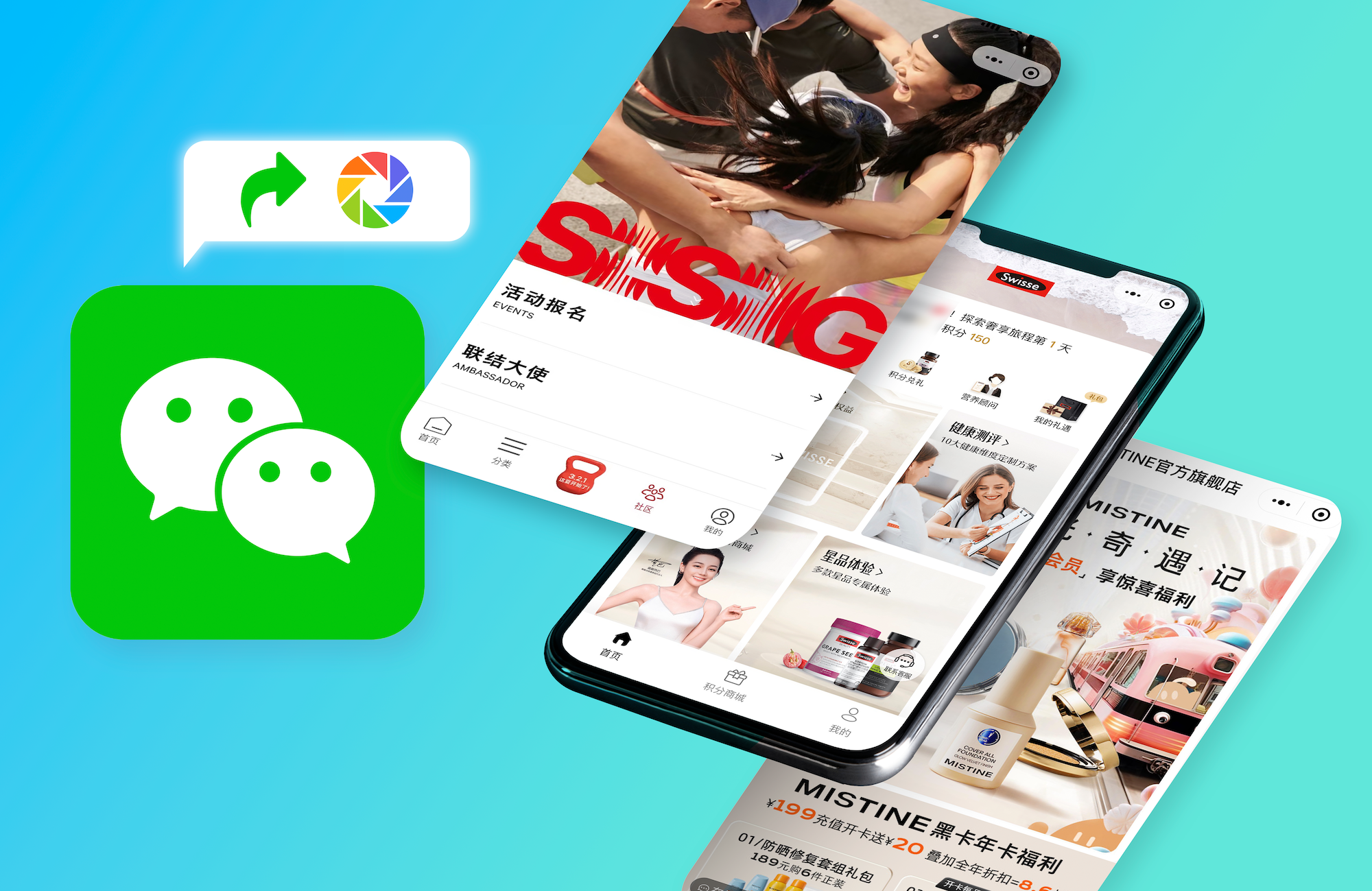
The future of China eCommerce is “WeChat” – right now, the amount of people placing orders on WeChat is increasing at an incredibly fast rate. Unfortunately, many brands fail to deliver a matching WeChat eCommerce UX/UI design: they allow users to enter their online shop through WeChat, but without any optimization for the WeChat system.
One way to gain an edge on your competition is to make sure your WeChat store is specifically designed for the WeChat ecosystem. Can't figure out what the best UX/UI design is for your WeChat shop? Let’s take a look.
WeChat Shop is a compact world
So how’s WeChat eCommerce interface different from other mobile shops, or eCommerce native apps?
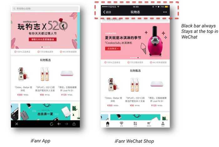
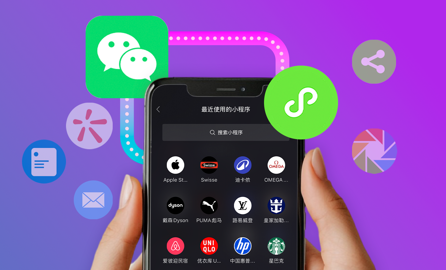
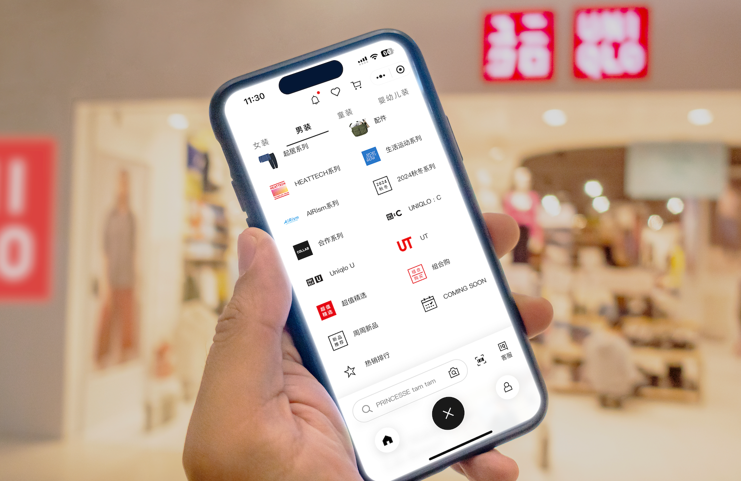
As shown above, mobile devices are small while WeChat's interface is even smaller. There will always be a black bar at the top: the screen size is more limited.
It is important to embrace this limitation instead of fighting it. Very often, WeChat stores clutter the small spaces with as many things as they can and the user does not appreciate this at all. The best shopping experiences are ones that are light, easy for your WeChat customers to use and, most importantly, buy something.
What makes a good WeChat UI/UX Design?
- Easy navigation
Ecommerce navigation should help shoppers find products quickly and easily - good navigation improves the online shopping experience and helps merchants increase sales and profits. Especially when size is slightly smaller in the WeChat interface, a clear navigation matters more: there is so mch you want to show, while the space is so small.
A typical solution would include a “hamburger” icon to represent category navigation. However, there can be different approaches for utilizing “hamburger icon” navigation.
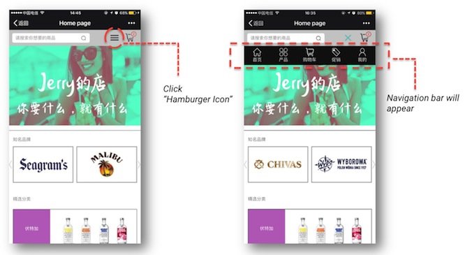
From example above, the hamburger icon presents a menu bar with direct access. These are the five most popular destinations one can choose from, and users can quickly get to the screens and features they want to access with only a few clicks. This “Show only after click” feature will present a clean user interface while giving directional navigation.
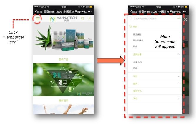
The other example works well for the WeChat shops that have a lot to present while room is far from enough: All the tabs will appear from the left after clicking the hamburger icon. These hidden menus help your customers avoid an overwhelming interface in a small screen.
Last but not least: a search bar is featured in both examples, because it is very necessary. When a customer knows what he/she wants, search bar will help.
- Filter leads the way
From thousands of products to only the ones that match - Filters enable users to narrow down your WeChat shop’s selection to match particular needs and interests. However, 94% of mobile eCommerce sites do not support such behavior.
A powerful filtering for WeChat eCommerce could be: to offer users to “filter within” their currently navigated category path. Meanwhile, expand and collapse is a better way to handle filters: it is clean and menu options are fat-finger friendly.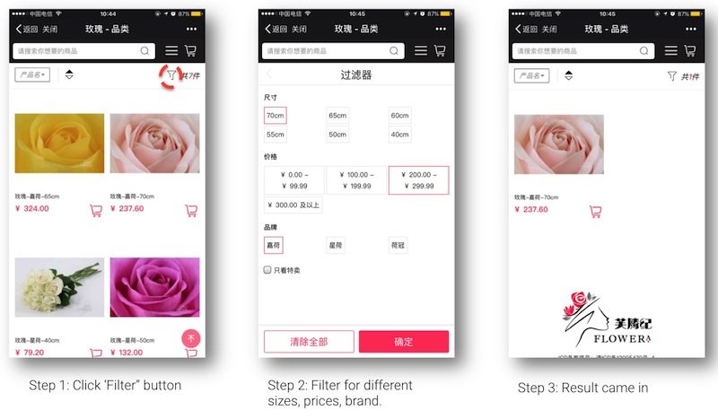
- Reduce redirects
WeChat users hate redirects: not only it requires more page loading time, but also could land users to an unknown site. So, if you must use redirects, make sure that you really really need them.
Truth is: alternatives can be considered to replace redirects and offer a better user experience. For instance, the small shopping cart button on product overview page. One click the button and it will allow customer to add the item into shopping cart without redirect to the product detail page.
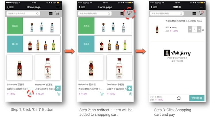
What's more, adopting different tabs in product detail page can not only avoid redirects, but also present a cleaner, more organized interface. Also, the sticky checkout/add to shopping cart button on the bottom will simplify the purchase process.
- Last but not least... Attractiveness!
The design for your WeChat shop has to be visually appealing. Not only that, it needs to combine eye-catching look and good usability. Customers will take more glances at a well-designed store, while they want the shopping process to be quick and easy.
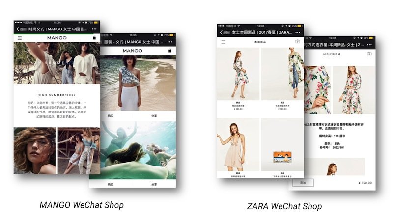
To sum up, user experience improvement is always among the most important things. After all, a WeChat user is using WeChat to browse through. Make sure you offer a simple and seamless experience that works under the WeChat system, and your visitors are more likely to place orders.


