eCommerce sites can be different from business website in many ways, and design is definitely a big part of it. Just like an offline retail in the shopping mall, a well-designed eCommerce will be both attractive to pull more customers in, and functional that can ease customer's purchase process, and convert visitors to shoppers.
Below are some useful tips to create a good eCommerce design, with the vital features that will help boost your sales:
User-Friendly Navigation
Navigation is very important part in any eCommerce's web design. A user-friendly navigation will help shoppers to find the items they're looking fore more easily. Hence, the goal is to create a smooth route from the site’s landing page all the way to the checkout.
First of all, section names should always be clear and not confusing. Categories should be well-organized and, whenever necessary, include subcategories to make it easier for online consumers to find the items that they are looking for. There should be consistency in terms of how you organize and format the sections. And of course, do not forget to include the page on terms and conditions of sale, as this is very important in online stores.
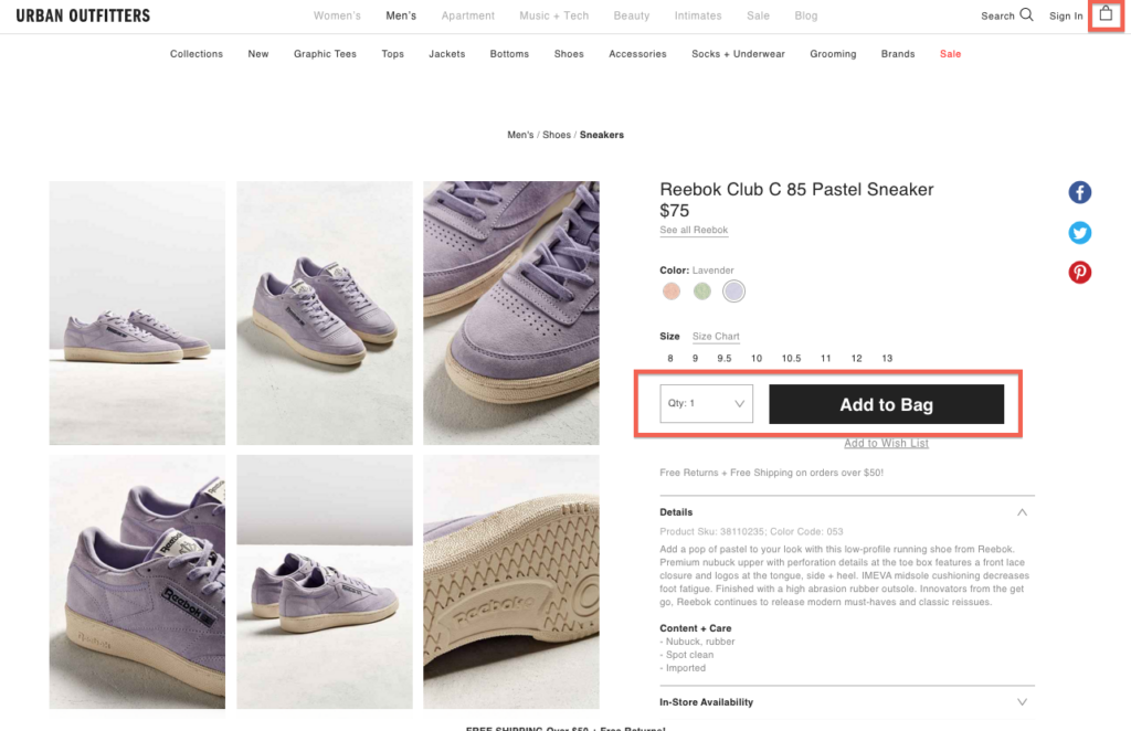
Urban Outfitters provides a clear navigation path, categorizing products based on gender first then shows a dropdown list of subcategories under each gender, such as featured items, clothing, shoes, and gears.
Urban Outfitters shows a clear path for customers to add stuffs to shopping bag, and pay for them
Always Think of Mobile Users
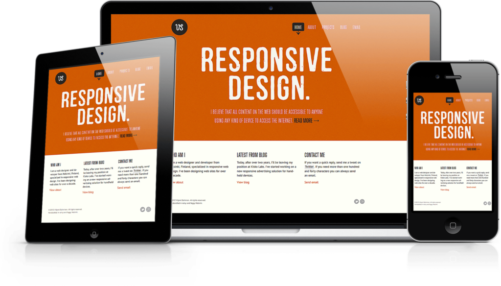
It's very common knowledge that increasing number of consumers are using these mobile devices to shop online. You should definitely consider your mobile design strategy, making sure that your eCommerce site has a responsive design that automatically adjusts to match the screen size of the device used to view your site.
Moreover, owning a mobile friendly eCommerce site will also help your rankings on searching engines like Google. Since last April, Google started prioritizing mobile friendly websites, labeling them as ‘Mobile-friendly’ to assist users in choosing links to consider when doing a search using their smartphones or tablets.
Loading Speed: Faster is Better.
About 40% of online shoppers will leave a site if it takes more than 3 seconds to load. The truth behind this brutal fact is: loading speed can adversely affect your site’s bounce rate and conversion rate.
Always check your homepage's load time.Implementing a design that loads quickly and using tools like plugins and compression tools can help prevent slow loading times.
Eye-catching large Images
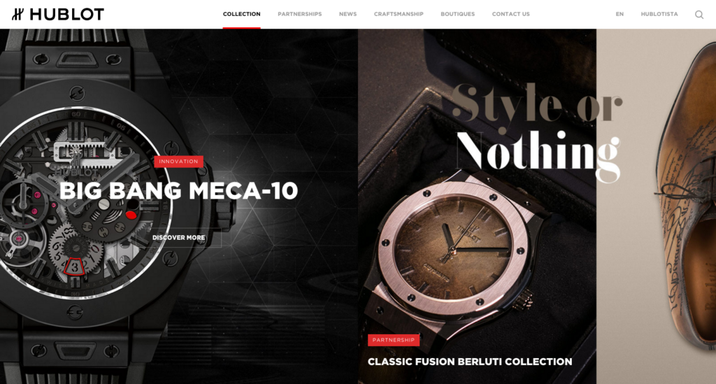
There is no doubt that people are more responsive to content with great images, especially those which are clear and appealing. It is no coincidence that a lot of websites now have huge, eye-catching graphics, like Hublot. When combined with a call to action, these large images can effectively drive your online customers to make a purchase.
The challenge coming along is the loading time, which can slow down your website’s loading speed. Compressing images would be one way to avoid this issue, or you can combine them into CSS sprites so the browser loads one image instead of several images.
Branding Consistency
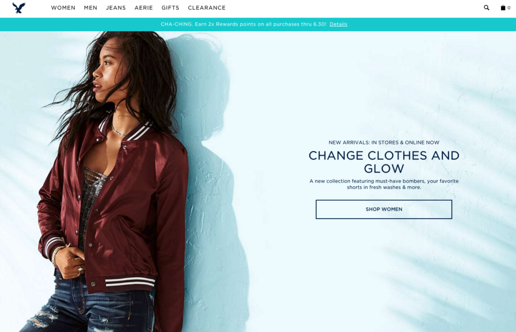
Your eCommerce site should reflect your brand’s personality. Keep in mind that always choose a design that is consistent with your brand image. Make sure that it is tailor-fit to your overall advertising, marketing, and branding goals and objectives.
American Eagles
Hopefully all these guidances will points out a more direct way to design your eCommerce site. If you are looking for a agency who can design and develop your eCommerce business in a professional and well-performed way, Contact TMO Group and we will help your business grow.
