When you start an ecommerce website, your online store is open 24 hours a day and people can access it from all over the world. However, designing an ecommerce website is not that easy. Everyone makes mistakes and more important are how to avoid them in order to boost product sales. The followings are 5 mistakes which we shouldn't ignore while designing eCommerce products pages.
1. Poor product details
Poor product details reflect your lack of confidence because of which you fail to earn the trust of your customers. In order not to let go off the customers, you must earn and maintain their trust. They tend to have faith in you if you display your products effectively.
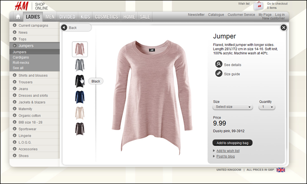
Product display is one of the most important things to concentrate upon when it comes to the eCommerce website design. Everything right from size and quality of the product images to the fonts, color and quality or product description matters. You must:
- Upload quality product images that are big in size, yet loads faster
- Mention every minute detail about the product in easy to read font style, size and color
2. Adding social widgets everywhere
One of the most interesting things that we found during the store reviews was that every store had social widgets. It seems that store owners add these because someone told them that having a Twitter button was important, and therefore they added them to the store, without much consideration for the impact they would have.
Consider the Twitter / Facebook / Pinterest / Google Plus widgets you have on your site. Do you really need them? Do your customers actually click them? In some cases, they can actually reduce your conversions.
The vast majority of online stores have social widgets on their product pages; the thinking is that shoppers will be so enthusiastic about the products that they’ll click these buttons and spread the word on social media.
3. Lengthy and Irritating Checkout Process
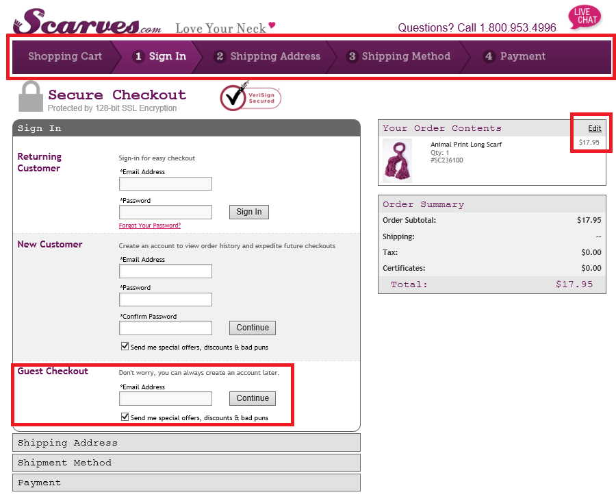
This is one of the most common mistakes in ecommerce web design. Remember, customers actually buy a product from the checkout page and if your checkout page is too long, people will leave your site without buying any product. Try to design a single page checkout and don’t ask unnecessary questions to your consumers.
4. Inappropriate Font Size
This is exactly how the user feels when the website design does not support a good font size and throws just about too much content on the poor user. He feels confused, lost, irritated and simply leaves the site to find answers elsewhere.
It’s important for us to have the right font size and the right break up of content on our website for the user to be able to read properly and comprehend the valuable information that you want to send out to him.
5. Too Much Happening On Your Landing Page.
Your landing page needs to have one focus and one focus only: Getting people to take ONE ACTION. The more you have going on, the more confused your visitors will be. Use a simple, clean design that allows visitors to focus on one thing and one thing only.
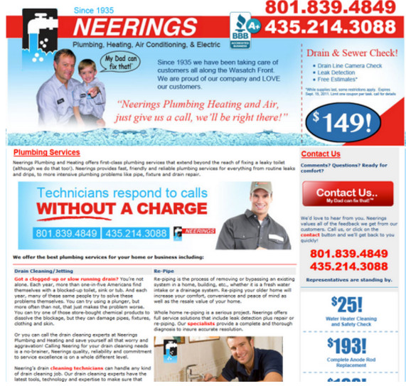
Landing page should be simple, informative, with all of the elements are pulling the story and action together.
Conclusion
The key to increasing your conversion rates is to reduce shopper anxiety and uncertainty. Thinking through these issues will help you avoid common eCommerce store product page design mistakes, ultimately boosting your sales and revenues.


