IOS, Android and Windows phone are 3 major mobile platforms. They have their own characteristics. As a result, the interaction design should also be any different. Today we'll talk about how difference among them and what should be noticed.
1. Layout differences
-
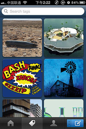
"tab bar" for ios
People who use ios system must be familiar with the design of "tab bar", which is still used today. Though some new layout such as the drawer-style navigation is on a trial basis, "tab bar" always be the most popular way.

-
Two controlling ways for Android
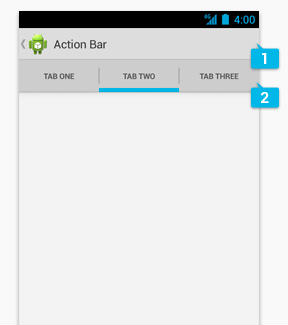
Android provided two controlling ways after the version 4.0 was released. One way is add a touch button, which is used to expand the menu.

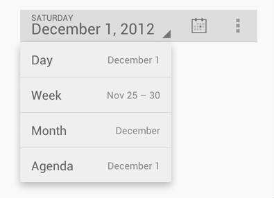
The other way is similar to ios. The second level menu has the ability to swipe left to right.
-
The innovation of windows phone
Windows phone makes a big difference with the other two. It advocates its own metro UI, which looks like reading in newspapers or magazines.
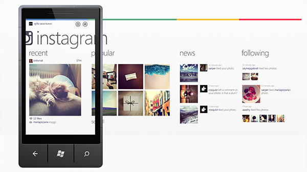
To be honest, these four columns are in the same page and they are loaded at the same time. It is really a big test for web designers because they need to consider how the page looks like while sliding in advance.
2. Navigation logic differences
As we all know that iOS doesn't have the entity "back" button. We can only go back through the "back" button on the screen.
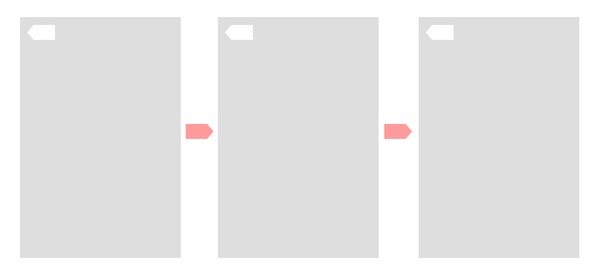
Both Android and windows phone usually have the "back" button at the bottom. The button is not only can be used to go back to the previous page, but also can go back to the previous operation.(e.g. open the keyboard)
3. Resolution difference
Do you know how many kinds of resolution Android have?
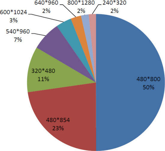
Adapt all these kinds of resolution usually makes us headache. It also has impact on interaction design. You need to take any resolution into consideration. But for iOS and windows phone, the resolution is fixed. IOS is 320*480, 640*960, 640*1136 and Windows is 480*800, 720*1280, 768*1280. It is just a slight change of length-width ratio.
