Attracting clients and converting them into paying customers may be the very function of an eCommerce solution. This is often achived by giving your customers having a shopping experience which has lasting effects. This is directly related to eCommerce form of your site that must be built with the prospective audience. Give your customers whatever they expect and you will have have a flourishing online business for yourself.
Understand your customers
If your products appeal your customers and meet their needs, they will probably buy things from your site. Actually, buying is an emotional decision. So make sure the description and design of your product pages is target audience. At the same time, get an idea of their shopping behavior and the many qualities that they’re looking for in an Ecommerce website to make a buying decision. Understanding your potential clients is crucial for the success of your Ecommerce site because they’re going to make a decision to buy your products based on the visuals and product information you have on offer. If not, it'll result in Reasons and Solutions for Shopping Cart AbandonmentFor many eCommerce stores, shopping cart abandonment is a a common issue. If you are an eCommerce merchant, reading this article can help you solving the problemsshopping cart abandonment.
Use Your Buttons to Create Color Pathways
The color and shape of your buy now and checkout buttons should stand out, not blend in.
Macys.com, a site that has undergone extensive conversion testing, provides a great example of utilizing buttons to create color pathways to guide shoppers. A simple example of this comes from their “shopping bag” page.
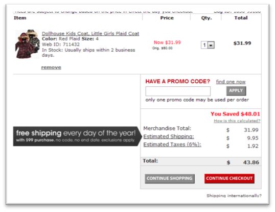
Unlike many sites that make all their buttons the same color in order to achieve design continuity, Macys makes their checkout button red, and greys out continue shopping. In fact, throughout the entire checkout process, any button that Macys wants you to press, because it propels you forward in the checkout process, is red.
Optimizing form structure
Consumers have grown accustomed to forms but there is very little consistency across online retail sites regarding how forms should be structured. Placing the form label directly above the form field creates a simplistic user experience that results in faster form completion times and less customer fatigue. It also creates a more mobile friendly experience by eliminating side-to-side scrolling, ultimately reducing form errors and improving the customer experience.
Show Shipping, Warranty and Returns Policies
Your customers may be ready to buy but there’s always that last-minute resistance. They might want to know how long it will take to reach them, or whether they can return it if it breaks. Answering these questions on your product page will go a long way in building trust and easing their concerns.
The most important part is your shipping rate. Shoppers hate being slapped with a shipping fee at checkout so show this on your product page, preferably right next to the product price. Also let them know how long delivery usually takes so they know when to expect the product if they order it.
A clear warranty and returns policy will seal any doubts about shopping on your site. No one wants a broken or defective product, but if you allow returns and it’s covered under a warranty customers won't have anything to worry about.
Stay Focused
Too many options and choices can be detrimental to the conversion process. Stay focused on a single product or service on each page. Do not try to cross sell before you’ve made the first sale. Be confident in the page. You don’t need to sell them on your whole organization right now, just on one thing at a time. When you build conversion friendly, you increase your revenue and the value of every visit that comes to your site.
TMO Group provide eCommerce website development services in China. We can build an eCommerce website that is conversion and friendly to customers. More details please send us an email!
