Minimalism is one of the modern web design trends. It makes the web page looks clean. But actually it is hard to leave a blank. Especially some clients would like to show more information in the page.
To be honest, some designers take this kind of web design as a challenge. It can also be used in print or package design. Today we'll show some good examples and see together how should we follow the trends of minimalist web design.
Simple content
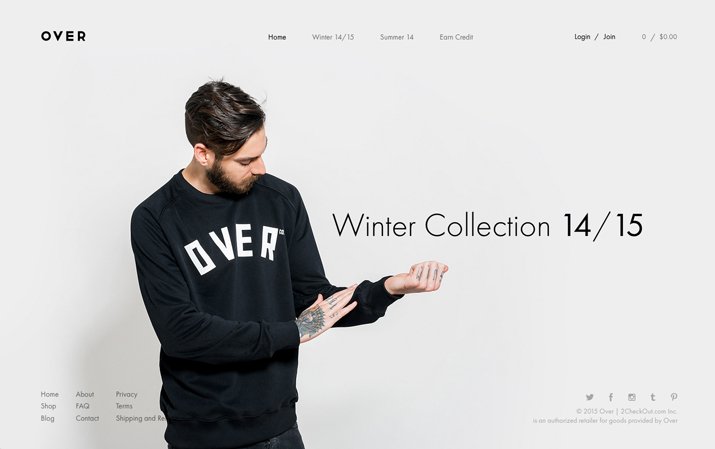
When it comes to minimalist design, what you see is what you get. Because there is no "design rules" for it. There are some points in the following, which are approved by most of designers:
- Use basic elements
- Simple function interaction
- Leave a lot of blanks
- Few colors
- Only one or two fonts
- Simple content
Minimalist is not only a theory. Even the word "less is more" is repeated many times, it still be one of the best way to explain minimalism. We can ask ourselves the following questions while we design the content:
- Is it easy to understand?
- Can it express easily to users?
- Is it clean enough for images and texts?
Forget skills of design
Over the past couple of years, designers have already talked about flat design and materialized design. It was also the time when minimalism design was born.
As we come up with a new design idea related to minimalism, we have to abandon all design skills and rules. Then we can start from some basic elements: color, type and space.
Focus on details
In minimalism, objects and elements shouldn't be hidden in your design. You must be careful about each detail. For example align some elements in terms of a better user interaction.
Think about layout
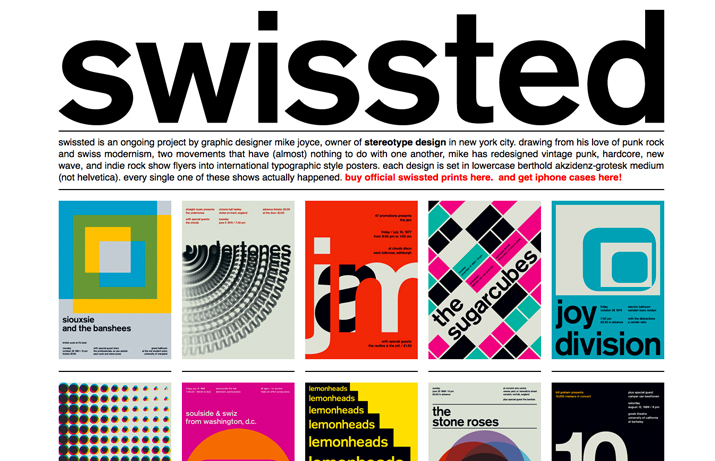
4 Critical Trends For the Website LayoutThere is no doubt that the layout is changing unpredictable. In this article we'll talk about some website layouts, which can inspire your web designLayout is also important in any web design projects. Generally speaking, characters should be the main element of images. And the bold font can also increase the readability. Don't put too many words otherwise it may confuse readers.
Have purpose for using colors
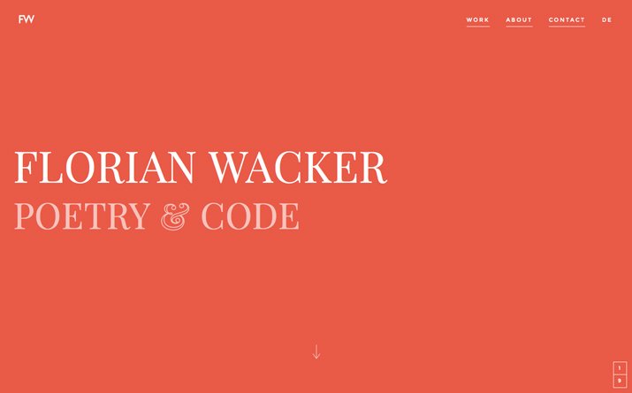
Sometimes we think most of minimalist designs are in black and white. Although it is a new trend, color is still needed. Normally we use one or two soft colors. But we need to think about where should we use it such as in background or just for some elements.
Edit your design
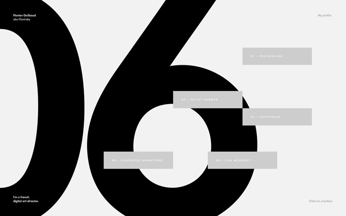
After finish the first design draft, you need to edit it because maybe there is still too many elements. Select a focus and delete all elements around. Then delete other irrelevent elements in the page. Repeat steps above, and you'll find the unnecessary elements for design.
People are always arguing about element selection. Why not try a new way and think about that do we really need:
- Icons of social media?
- Ads and catchword?
- RSS subscription?
- Multi level menu?
If you feel not comfortable after delete some elements, get them back. Finally you'll be satisfied with your eCommerce Website Page Design: How to Match ColorsBefore designing eCommerce website pages, nearly none of us look at theories, which probably cause us bored. But after that, reviewing these theories sometimes can inspire usweb page design.


