All of us are perhaps familiar with the B2C eCommerce user interface (UI) / user experience (UX) design since it is omnipresent in our lives. All B2C websites and apps strive to provide the best UI / UX design in order to create a pleasant shopping environment and maximize the conversion rate. On the other hand, B2B eCommerce sites have very different functional features due to the different nature of transactions. This has changed as enterprises must now understand the importance of UX design – B2B eCommerce sites are no longer some outdated order form system but becoming more user-friendly and becoming more akin to their B2C counterparts. Here's an example of eCommerce design development, that clearly did not stand the test of time.
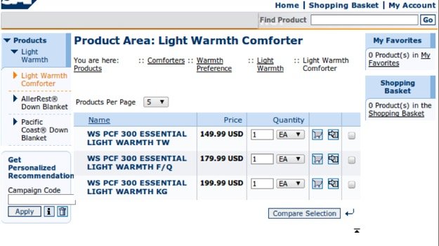
Good B2B eCommerce design no longer uses catalog-like displays
Good design and favorable functions mean satisfied users, less support and training, and a streamlined conversion process. B2B eCommerce has many qualities separating itself from B2C so let’s deep dive into special features that a B2B site should have. Here's a list of eCommerce site features that will help to increase its efficiency and streamline experience for the users.
B2B Feature 1: Self-Service Functionalities
In an industry undergoing massive digital transformation, there is no longer a need for obsolete cold-calling or reordering over the phone with a sales rep. Self-service apps or portals address this new need by allowing customers to order on their own terms. Through adding this functionality to your website, your customers will be able to ask for quotes, research your products, place orders/reorders, check order status, and gain access to a knowledge base, etc.
Websites that over little more than a digital copy of a paper catalogue are history. Modern eCommerce website (B2B is no exception here) is a interactive space that will often elicit necessary information about client's needs, finds the best solution to address those needs, explain all the details and technicalities client needs to be aware of. Finally it will provide a convenient place to order necessary items and track their progress to the client in real-time.
However, it is important to maintain the balance between full automation and human interaction because after all, B2B is based on developing and nurturing a relationship with the customer.
B2B Feature 2: Easy Connection to the Sales Team
Imagine a potential customer browsing your website. So far things are going smoothly - you seem to have what they want and the price seems to be in the range they are comfortable with. Yet, B2B purchases usually require a lot of small details to be clarified, a lot of minutia to be taken care of. Is this assembly the right type? Is the maintenance included? How far does the warranty go? All questions need to be answered to make the final decision.
So, next thing the prospect does is to search for an email to send all these questions to. It must be somewhere in the “Company - about us - how to get in touch - choose department - choose reason, choose some other unrelated thing” section. Then to compose a polite email listing all the points needed to be addressed, then wait with bated breath for the reply to proceed with the purchase. Or, alternatively, continue with another company that understands the importance of convenient communication. (If you think the browser tab your website is on is not surrounded with competition, you have another think coming).
Point here is: the customer may and will have questions and should be one click away to help him find answers. Chatbots are popular solutions (just don’t overuse them, it can feel a little intrusive, like a door-to-door salesman. Email, or feedback form should be clearly visible at all times, accompanied with a non-intrusive message letting visitors know that you are available for contact to answer whatever question they may have.
B2B Feature 3: CTAs
Calls-to-action (CTAs) are an essential component to any company’s lead generation efforts and for any inbound marketing strategy. Similar to landing pages, CTAs’ main purpose is to drive conversion, and effective CTAs drive prospects to make a desired action.
First, you must be clear of what your conversion goal is, as a webinar registration requires different messaging than say, a trial download. Designing an effective and compelling CTA requires a continuous process in terms of message copy, design, and placement on the page. It may also be helpful to make use of A/B testing in order to see how visitors react to different variations in your CTA design.
All in all, CTAs must be designed to be both specific and simple, so visitors can easily understand what they must do to get their desired results.
B2B Feature 4: Pricing Pages
B2B pricing models are complex, and if you want to also sell on your website rather than just collecting leads, a pricing page is a must. Here are some key aspects to address when developing a pricing page:
- Provide the right number of pricing options (pricing tiers or packages designed for your buyer)
- Ordering of the plans (typically display the plans according to price from low to high)
- Include annual plans, discounts at next renewal, and free trials are all important to attract customers
- Highlight specific plans to provide guidance to customers and give them an idea of what plans similar products have chosen
- Social proof can also be important to build trust in the customer and you can do so by listing case studies and testimonials from previous satisfied customers
B2B Feature 5: Flexible Ordering
The purchasing patterns of B2B buyers are drastically different from those of B2C customers. It is important to ensure your B2B website contains the following functionalities.
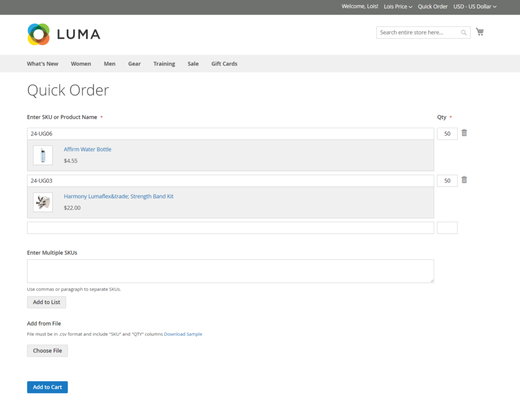
- Bulk ordering and discounts: B2B customers often order large quantities, so it is crucial to optimize the checkout process with the necessary built-in functionalities. Some factors to consider are dynamic prices, changing in real-time, according to certain criteria specified by the buyer. Volume discounts or total orders discounts based on quantity ordered should also be available.
- Minimum order quantity: B2B vendors often impose this restriction in order to maintain margins, adopt this feature if it applies in your case
- One-click reordering: Reordering is a repetitive and routine task, and it is convenient for both you and your customer to enable one-click reordering and saving your customers information for the next time
- Automatic renewals: Package your services/physical goods as subscriptions and entice your customers to switch to auto-renewals for speed and convenience
Summary
The user experience of B2C has been mentioned for quite a long time while B2B is finally on the right track. Apart from those common UI techniques, you should notice that the site can support a complex buying and decision cycle with content. Clear information of products with case studies stated could also facilitate the decision-making process. Well-tracked quotation management and user-friendly UX help buyers find products that best match with company needs.
If you'd like to explore your options for eCommerce Website Development, send us a message through the "Contact us" form. We have there expertise needed to make your Chinese eCommerce project successful.
