B2B eCommerce websites are kind of a big deal. From sales, customer engagements, marketing, recruiting, and showcasing your company as a whole, your B2B website is the central hub for all business activities.
Whether it’s your first time building a B2B eCommerce website, building and running an independent publishing site is no easy feat. Here’s a checklist of best practices that can help businesses ensure that their B2B website is of professional quality that will optimize both the reader experience and your revenue potential.
1.Understand your customer
 Because you're selling to a business and not a general consumer, the dynamic is different. By getting to know your best customer, we can help craft an online experience that meets their needs, and appeals to their aesthetics. Establish a consistent voice and persona for your site. This can vary widely; it depends on what exactly it is you're selling. While some companies are light-hearted and personal in their tone, others are serious and formal. Know who it is you want to visit your site, and develop your voice and overall personality around that.
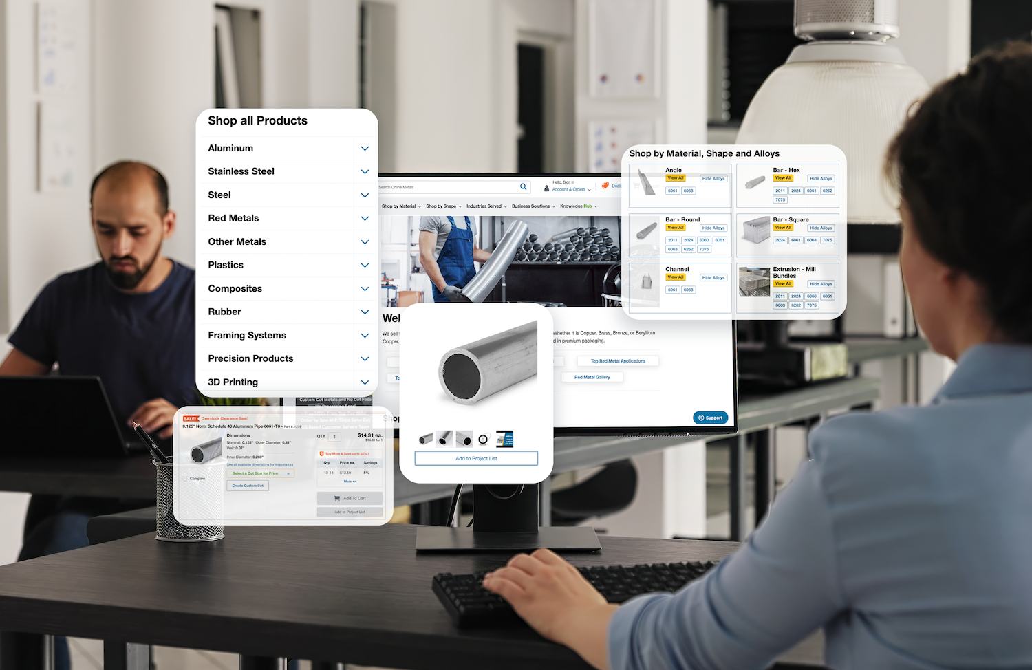
2. Build a perfect B2B product page
Whether the buyer is signing up for a service or product, B2B purchases often require more information, research time, and ultimately more decision-makers than a typical consumer purchase. Good B2B product pages reflect the distinct way that these purchases are made, and should be designed differently than B2C pages. Here are some emphases you should to focus on:
1) Research how visitors consume your product pages.
The product page has to do a lot of the heavy lifting when it comes to satisfying the questions a prospective customer has before they contact your company.
2) Develop product positioning.
Your product positioning needs to be present on your product pages, loud and clear. It should be the very first thing a viewer sees on the page and fit well with the visual components.
3) Know your audience and use the language and terms they use.
If they like it casual, keep the description casual; if they respond better to ultra-complex, high-tech jargon, use that. To determine what appeals, check the comments people leave on your B2B website, analyze your competitor’s site, or listen to a few calls with your sales team and note how your prospects talk.

4) Calls to Action: How to Buy, Where to Buy, or Next Steps.
Not providing the right call to action can be the most costly mistake in B2B online marketing. Some might say that customers can always find a phone number on a site’s Contact Us page, but since the golden rule of Web user experience is don’t make me think, you should make finding this information as easy as possible.
5) Related or Similar Products Customers Might Find of Interest.
When your customers arrive on your product destination pages, don’t forget to present such opportunities. Show similar products that you offer. Show related products that work well together. Enable your customers to explore your products through a connected experience. Provide solutions instead of single products.
3. Make Social Connection Easy
 Plan to integrate icons that connect to your social platforms right on the home page. When someone wants to get in touch with your business, they may be more comfortable using some social media than giving you a phone call. Make it easy for prospects to reach out and connect with you on social media. Also clearly display your phone number and a link to directions on the website home page. This will help visitors on mobile and tablet devises to get the information they may be searching for.
If the reader enjoys your content so much that they would like to share it with their followers, then by all means make it easy to share. On your company blog, include buttons that allow readers to share your content to WeChat, Weibo or Linked-in.
Another good place to add social share buttons is on the thank you pages. After someone has downloaded a piece of content, let them share the landing page with their following. This can be a great way for the news of your content pieces to spread through social channels.
4. Write blog posts to support cornerstone content
Blog posts are the baited hooks that bring visitors to your B2B website. As decision makers search for solutions to their challenges, they will stumble upon your blog posts. The purpose of these posts is to engage the reader, provide them with an answer to their question, and offer them an opportunity to take a next step to learn more by downloading your content.

The best way to outline blog post topics in a repeatable way is to elaborate on a specific topic covered by the cornerstone content piece.
5. Don’t beat around the bush
B2B markets generally know what they are looking for and they want to find it immediately. Make sure your site is developed in such a way that your primary products and services can be navigated to quickly and easily. Avoid clouding it with too much information – all content should be straightforward and clear. In this instance, less is more!
A well-designed B2B eCommerce website should act as an addition to your communication tools. It should run harmoniously with any other promotional materials you have including booklet printing and it should be developed to complement your corporate branding including that on your to business card printing.
More details about B2B eCommerce website development, please refer to: https://www.tmogroup.asia/ecommerce-website-development/

