For brands looking to launch in China in a big way, a brand web-store can be a tempting option. These brands generally want to make a splash and make their products seem more exclusive than if they just launched products on existing marketplaces. However, not only does this approach require significant marketing efforts to bring consumers to this brand web-store, it also means paying careful attention to Chinese website design norms. As anyone who's even passingly familiar with both can tell you, Chinese websites do not look the same as those in the West. What works in America and even most of Europe simply doesn't succeed in the same way in China, where they like things to be done their way. In this article we take a look at what some of those key differences are for companies wanting to launch their own eCommerce site in China.
Information Density: White Space versus Space Efficiency
The most obvious, and indeed most famous, difference between Chinese and Western sites is density. A single glance at most representative sites will show that Chinese sites are densely packed with links, information, and advertisements. It seems that the preference in China is for as many resources and options to be available immediately without having to navigate away from the page. Meanwhile Western sites prefer to use lots of white space to draw the viewer's eye to a few key focus points.
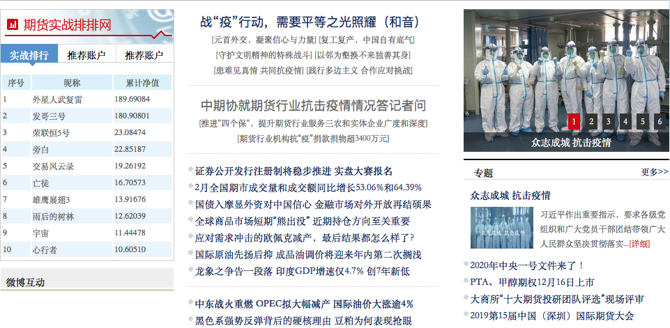
An example of the kind of information density more commonly seen on Chinese websites (Source: http://www.qhrb.com.cn)
This is especially true for home pages. Some brands in the West don't even provide easy access to the web-store part of their site. Instead they showcase profiles of major products or projects, or simply a brand statement. Slideshows, large poster-like images, and other visual-focused experiences communicate brand messages and give users a strong impression of featured products. However, this can present a multi-step obstacle to actually making a purchase. A real problem for the customer in a hurry to make a purchase they've already decided on. Chinese sites meanwhile rarely employ this approach. As stated above, Chinese users like to have all available options presented to them immediately. Links to specific parts of the site, product categories, or specific products tend to be abundant on Chinese web-stores.
Adverts too aren't considered as undesirable in the West. Trusted mainstream sites pad their website's visual space with ads, and even use pop-up adverts without a negative user response. This is in stark contrast to the West, where this would suggest a poorly made and untrustworthy site to most users.
Opening Links: Linear Journey versus Multi-Path
Part of the above is due to a difference in the philosophy behind both design and user experience. In the West, it's common to design to guide a user on a focused journey, from landing to product information to purchase. Designers place emphasis on the former two steps. Therefore clicking a link on a Western site takes the page to the next step in their website journey. In China, however, users like to branch in multiple directions rather than be directed along a singular linear route. Therefore, they are provided with all important available directions through a large number of links on the first page, as mentioned above. Additionally, clicking on a link opens It in a new tab. This means Chinese users find it easier to return to the first page and go in a different direction after finishing with the first.
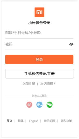
A typical mobile eCommerce app's login page, including the option to log in via popular eWallet Alipay and social media giant WeChat (Pictured: Xiaomi app)
eCommerce Ecosystems: Differences Great & Small
The fact of the matter is, in many ways the Chinese internet is its own world. Websites like Facebook, Twitter and Amazon dominate the internet in the West. In China, the internet superstars are homegrown behemoths like WeChat, Douyin and Taobao. Many of these began their lives as apps, or quickly pivoted in that direction. As a result, the expected features of an eCommerce site in the West (such as Facebook integration may be completely different to those in China (such as QR code integration).
In China, the mobile-first ecosystem combined with the presence of WeChat in almost every facet of modern life has meant that for years, apps and platforms have used QR codes to facilitate a mobile-enabled life. Just as restaurants there now leave QR codes on the tables for customers to use to order food or claim discounts, eCommerce sites also frequently integrate the functionality to help with things like login and payment.
eWallet integration is an absolute must in Chinese eCommerce. So much so that some services can get away with not including a card payment option at all! These platforms design their payment mechanisms to be eWallet-first. Therefore, you often don't see common card-first design decisions such as requiring a billing address when setting up payment options.
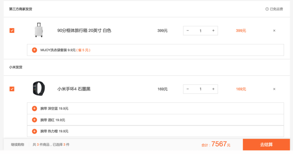
Chinese web-stores commonly allow you to tick items in your cart off and on for checkout (Pictured: Xiaomi store)
Another difference to the West is that Chinese sites typically require login early on in the shopping process. Amazon allows for temporary 'guest' users to add items to their cart and so on. The platform essentially lets users browse as though logged in until the very last moment. However, Chinese apps prefer you to log in as soon as possible. This lets them track more information and tailor recommendations to your known behavior. To this end they make login quick and easy. You can even log in using your eWallet account. This is quicker and preferable to dealing with forms to fill out as in the Amazon signup process.
Speaking of shopping carts, the expected norm in China also differs here slightly in another way. Amazon keeps firm segregation between its shopping cart and its "Save For Later" list. The former is all taken to checkout together. The latter is not checked out until it is added back to the cart. On major platforms, you can tick items in the cart on or off before taking the ticked ones to checkout. This encourages a culture of keeping one's cart filled with potential future purchases. Which is starkly different to the easily neglected Save For Later list (though Chinese platforms often have these as well).


