Before the eCommerce website design, the account manager or product manager will usually put forward their perspective of the website style. For example active, steady, reliable, atmosphere and so on. Generally speaking, color gives the first impression of the website.
An excellent eCommerce website should be quite impressive. Normally all of us have our own unique sensitivity to color. We can say that color is the major standard that we judge website beautiful or not. So this article will give a color introduction, which can help you in eCommerce website design.
1. Color ring
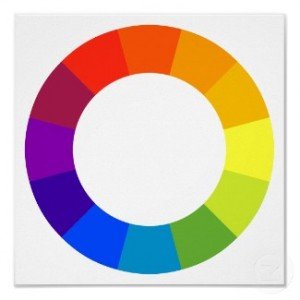
The color ring is consists of 12 basic colors, which includes three primary colors: red, yellow and blue. Other colors can be produced by these three colors. And they keep the same distance in the color ring. Between these three colors, there are also secondary colors and tertiary colors.
2. Color relations
Monochromatic matching: It only has one color, which mixed with its light, medium and dark. Although it has seems no level for colors, it shows the level of light and shade.
Analogy color matching: We called two neighbour colors as analogy color. It looks harmonious.
Complementary color matching: Complementary colors means two opposite colors in the color ring. It has a strong contrast. It conveys the meaning of energy and excitement.
3. Color emotions
- Blue
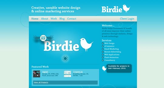
Blue calls to mind dependability, trustworthiness and security. It is also calming and has an element of spirituality about it.
So, if you want your eCommerce site to be seen as trustworthy and efficient for conducting business, use blue in strategic locations for best results.
- Green
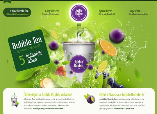
Green, the chromatic representation for nature itself, is a color for growth and versatility. It is very easy to the eyes, giving the visitors to your site a more relaxed feeling. The color is also, not surprisingly, common on websites passionate about environmental issues.
- Yellow
Presence of yellow color increases cheerfulness and warmth in people. Yellow brings excitement in purchasing items and assist convey a sense of happiness to the site.
As such, you can use this color in sections of your eCommerce site where you want your visitors to explore further, for example, in call-to-action buttons.Amazon, for instance, utilizes yellow in its “add to cart” button to great effect.
- Orange
Orange is a more balanced and less overwhelming colour than red. Vibrant, energetic, friendly and inviting, it is ideal for designs that need movement and energy.
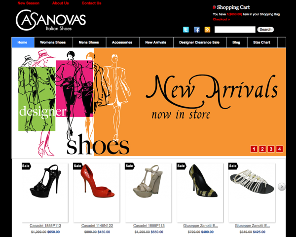
More so, it’s a fun color that can lead to a feeling of haste or urgency on a site. It is better to use orange sparingly to direct the interest of the site visitors to something. If it is used excessively, it may be overpowering and distract shoppers.
- Red
Red is a stimulating, exciting color. It is associated with passion, power and sometimes anger. It can be used for warnings or to show danger, but it can also suggest strength, determination and boldness.
- Black, White, and Gray
Black, white and grey are usually background colors, allowing brighter colors to make the real impact. Still, they call to mind their own associations.
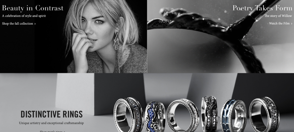
Black suggests power, modernity and sophistication, while white suggests cleanliness, simplicity and innocence. These competing associations play off of each other as nicely as the colors themselves do, making black and white designs especially strong.
Grey is a neutral color. When used well, it is associated with tradition, sombreness and calmness. When used badly, however, it can cause a design to lack energy.
