According to statistics, over 1 billion people have experience in online shopping, which takes over 40% of internet users. Besides getting a piece of this pie, the goal of every eCommerce business is to increase their market share and get more ecommerce conversions.
In fact, getting website traffic is a great start, but it doesn’t guarantee sales. Here are 5 eCommerce solutions to help you convert your eCommerce website visitors into buyers.
1. Designed to sell
A customer’s journey through a website is referred to as user experience or ‘UX’ for short. eCommerce web designers now focus on UX to ensure that the designs they create make it quick and easy for customers to find what they are looking for and make those all-important purchases.
Making tweaks and adjustments to your customers’ journey is pretty straightforward if you have had your site designed specifically for your business, rather than using an ‘off the shelf’ template. This is why online retailers tend to favour a bespoke ecommerce platform, as updates are simpler to make.
2. Optimize the “add to cart” buttons
Viewers don't react that well to indirect call-to-action buttons(CTA) like “learn more” or “more details”. On the other hand, direct and specific call-to-action buttons like “buy now” or “add to cart” fetch a good response from shoppers.
Color is also a vital design aspect when it comes to CTA. Certain colors may trigger different types of visitor behaviors, based on the business type. Gentler colors like blue and green generally encourage viewers to follow-up, while red and orange have shown a deteriorated “add-to-cart” button performance.
3. Highlight your client’s best-selling products
Around Christmas, the number of first-time shoppers is higher than on average. New customers don't necessarily know the brand/store they're visiting. They're in need of inspiration, and they need it fast. Make sure your client’s homepage is geared towards showing the most popular products and categories. Popular categories ensure a high click-through rate onto pages that are likely to sell.
A way to do this is to add automated bestseller lists on the front page, and main categories using an app like Nosto, for example. To highlight ‘trending items,’ you could show bestsellers from the past seven days only.
4. Utilize online chat
It’s hard to get more personal on your site than with online chat. It’s a great way to engage your customers, answer questions and solve problems.
According to Forrester Research, “44% of online consumers say that having questions answered by a live person while in the middle of an online purchase is one of the most important features a Web site can offer.”
Make sure your chat window is out of the main view path of the visitor, but it’s still easy to find. If your software allows you to put a message on the chat window, go with something open ended but helpful, such as “How can I help you today?” You’re putting the customer in charge, where he can engage on his own terms. Olark is a leader in online chat, but there are other alternatives as well.
5. Use thanks pages
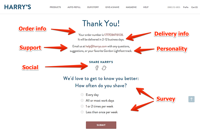
The best time to sell is right after you’ve made an initial sale. Whether you have an ecommerce website or you use your site strictly for lead generation, a thank you page is key. Most thank you pages are basic and generic with a message that reads something like, “Thank you for shopping with our company. Your order will be shipped shortly.” This type of page is better than nothing, but there is lots of room to expand from here. For example, after the previous message, you can add, “While you’re waiting, download one or more of the following ebooks,” with links to the ebooks. You'll be shocked at how much this simple addition to your website will start increasing your conversion rate.
