Struggling to grow or fix declining order volumes for your eCommerce store? From high return rates to logistics delays, user experience pitfalls may be silently dragging down your brand growth!
In this article, we will be analyzing the full chain of User Experience optimization strategies that successful global brands such as SHEIN and Anker use, uncovering 10 best practices that can help you accurately solve these UI/UX pain points, improve user satisfaction, and help your brand stand out in the highly-competed global eCommerce landscape.
TMO Group specializes in conversion-driven UI/UX Design for eCommerce, applying best practices for web design localization, market entry, and Global eCommerce.
I - Shopping Experience: Aim for Love at First Sight
1. Design an Intuitive and Friendly Interface
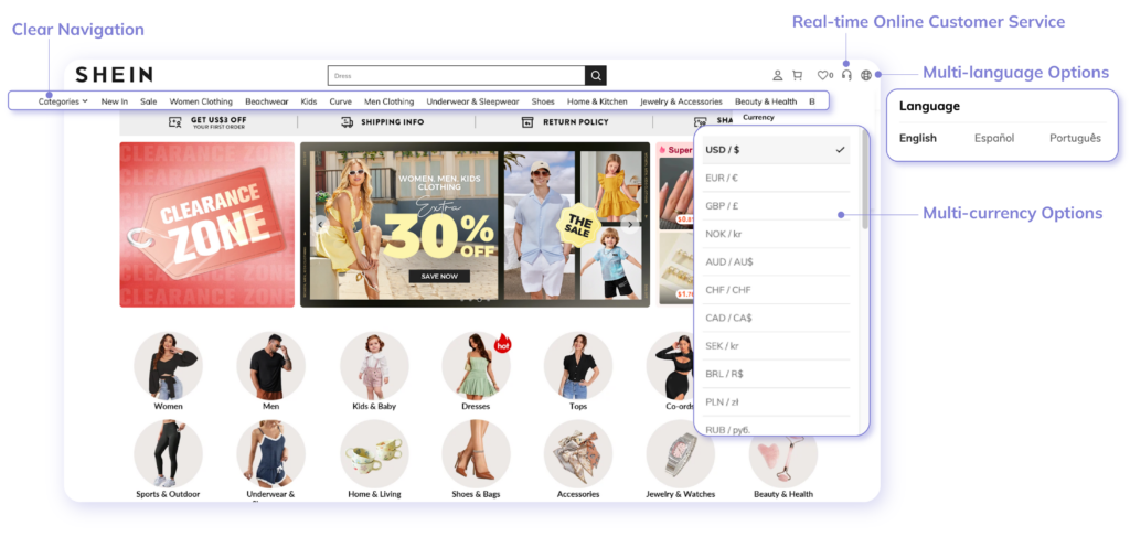
A clear navigation bar and hierarchical structure can help users quickly locate and easily find the product category, brand, or specific product they need. This is why the layout of your store should be as concise and easy to navigate as possible.
In Global sites, user groups usually come from different countries and cultural backgrounds. Providing multilingual interfaces and multi-currency options for users from the target countries or regions can ensure that users can browse and shop in the language they are familiar with.
Furthermore, maintaining consistency in the website's colors, fonts, icons, and other visual elements will make users feel familiar and comfortable throughout the shopping process. Product pages should have high-quality pictures, multi-angle displays, detailed product descriptions, and clear price and inventory information so that users can quickly understand the product's features and value and speed up their purchasing decisions.
SHEIN offers excellent navigation
A successful case is SHEIN, a Chinese eCommerce brand known for its fast fashion products. SHEIN provides multiple language and currency options on its global website while ensuring that its design is simple and easy to use with clear navigation.
At the same time, it provides online customer service to promptly resolve user questions. SHEIN has successfully attracted a large number of users from different countries and cultural backgrounds. In 2023, SHEIN's profit exceeded US$2 billion, doubling its profit.
2. Personalized Recommendations increase Conversion Rates
Accurate data analysis can open the door to recommendations more targeted and increase purchase intention. By utilizing historical data to recommend relevant products to users according to their browsing history, click behavior, search, and purchase history, brands can recommend relevant products in real time based on user interaction.
Using personalized emails for recommendations is also a common marketing technique. These emails can include products that users were interested in but did not purchase (cart abandonment), new product recommendations, or discount information can all effectively increase repurchase rates and user stickiness. Such personalized recommendations have long been widely used on leading eCommerce platforms such as Amazon, but many brand independent sites also use such personalized recommendations.
Anker provides high-personalization
Brands can even go further and allow users to set certain settings or give feedback on personalized recommendation logic, such as providing a "not interested" option or adjusting recommended preferences. This transparency not only enhances user participation but also makes recommendations more accurate.
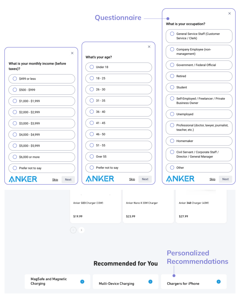
One remarkable example is Anker, another Chinese company mainly engaged in consumer electronics. The brand provides personalized recommendations to global users through its cross-border eCommerce platform by allowing consumers to provide some background information that guides product recommendation, as well as to make product comparisons via cross-filter dimensions, effectively increasing brand-consumer interaction.
3. Optimize Mobile Experience
Mobile pages need to have a responsive design to ensure the best visual effects and operation experience on different screen sizes and devices. Page elements should automatically adjust according to the screen size. Since mobile devices have smaller screens, interactive elements such as buttons and links should be designed to be large enough and reasonably spaced to facilitate user clicks.
The mobile interface should have a simple navigation structure to facilitate users to quickly find the content or products they need. Using a hamburger menu (side menu) can effectively save screen space. The checkout process of mobile shopping should be simplified as much as possible, and pop-ups and advertisements should be used sparingly on the mobile interface to avoid blocking the main content or interfering with user operations. In particular, pop-ups that are difficult to close should be avoided to avoid user friction and abandonment.
Reducing the information that users need to fill in, providing auto-fill function, and supporting multiple mobile payment methods (such as Apple Pay, Google Pay, etc.) can greatly improve the user conversion rate on mobile terminals.
OnePlus gets a shout-out for responsiveness
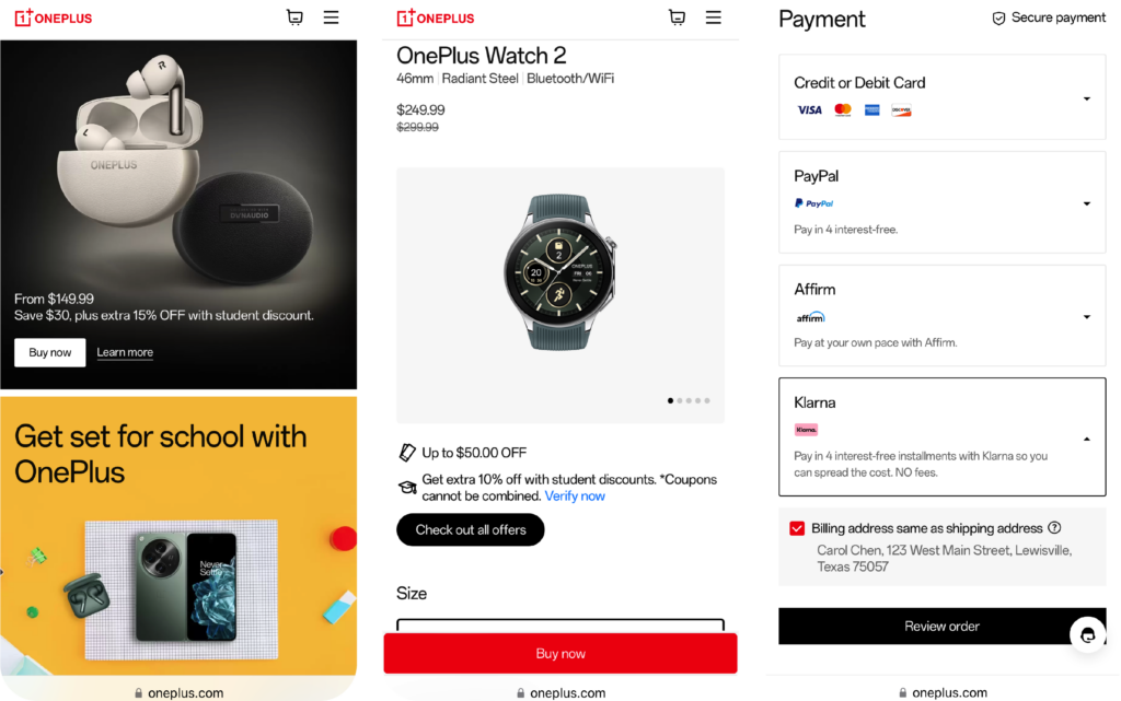
In this regard, OnePlus has done a great job with a brand website that is mobile responsive. The homepage simplifies icon elements such as the shopping cart and uses a hamburger menu to save space. The product recommendation card uses buttons and links that are easy for users to click and provides multiple international payment methods such as PayPal. These measures help OnePlus users in multiple international markets to complete shopping quickly and easily and promote sales conversion.
II - Payment Experience: Try to Reduce Hesitation
4. Provide Diverse Payment Methods
Cross-border eCommerce targets users from different countries, and the payment habits and preferences of each country may be very different. Therefore, providing a variety of payment methods, such as credit cards, PayPal, Apple Pay, Google Pay, and local payment methods (such as Sofort in Europe and UPI in India), can effectively increase the success rate of user payments and reduce order losses caused by payment problems.
5. Ensure the Security of the Payment Process
Payment security is one of the core issues that users are concerned about. Brands need to ensure that the payment page has security measures such as SSL encryption and PCI DSS compliance, clearly informing users of the security of their payment information during the payment process. User experience designers should focus on optimizing the layout and interaction of the payment page to make it concise and clear while conveying a high sense of security.
Tineco reassures users during checkout
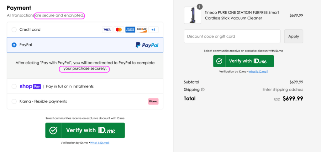
For example, home appliances brand Tineco seamlessly guides users on the checkout page with prompts regarding the security of the online portal and its integrations with payment providers and other third-party services.
If your brand is exploring ways to improve the user engagement and drive conversions, make sure to check out our eCommerce Growth Services
III - Logistics Experience: Make Users Look Forward to It
6. Real-time Tracking and Transparent Logistics
Logistics experience is a critical factor affecting user satisfaction in cross-border eCommerce. Brands need to ensure that users can track the order status anytime and anywhere after placing an order. By integrating data from multiple logistics service providers and providing clear logistics information displayed on the user interface, users' sense of trust and security can be enhanced. Customers should be able to view the order processing status, logistics progress, and estimated delivery time in real time.
7. Optimize Logistics Speed and Cost
One pressing question faced by cross-border eCommerce businesses is how to provide fast logistics services within a reasonable cost range. Brands can shorten delivery time by cooperating with multiple international logistics service providers to establish an efficient logistics network. Providing different levels of logistics service options (such as standard delivery, expedited delivery, etc.) allows users to choose the right logistics solution according to their needs.
OnePlus gives great clarity and options for shipping
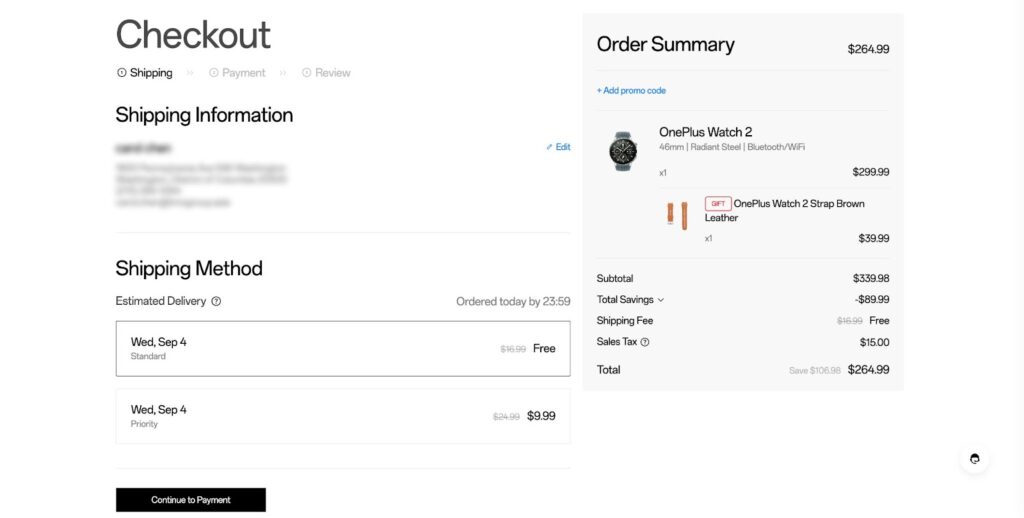
At the same time, brands should clearly display the cost and estimated time of various delivery services in the interface design. For example, OnePlus marked the price and estimated time of arrival when letting users choose the mailing solution to help users make decisions quickly.
8. Provide localized after-sales service
Problems such as delays, package loss, or damage during the logistics process are inevitable, so it is particularly important to provide timely and effective after-sales service. Brands should establish localized after-sales service teams covering major sales areas to ensure that users can get help quickly when problems arise. At the same time, UI/UX design should support convenient after-sales application and communication channels, such as online customer service, automated query systems, and other touchpoints to improve user experience.
IV - Customer Service Experience: Make Users Feel at Home
9. Real-time multilingual customer support
Global eCommerce customers are spread all over the world, and users in different countries have different schedules and language habits. Providing real-time multilingual customer service support can ensure that users can get help in a timely manner whenever they encounter problems. With the help of AI and chatbots, the pressure on manual customer service can be effectively reduced during peak hours or when handling routine inquiries.
SHEIN provides fantastic AI customer service
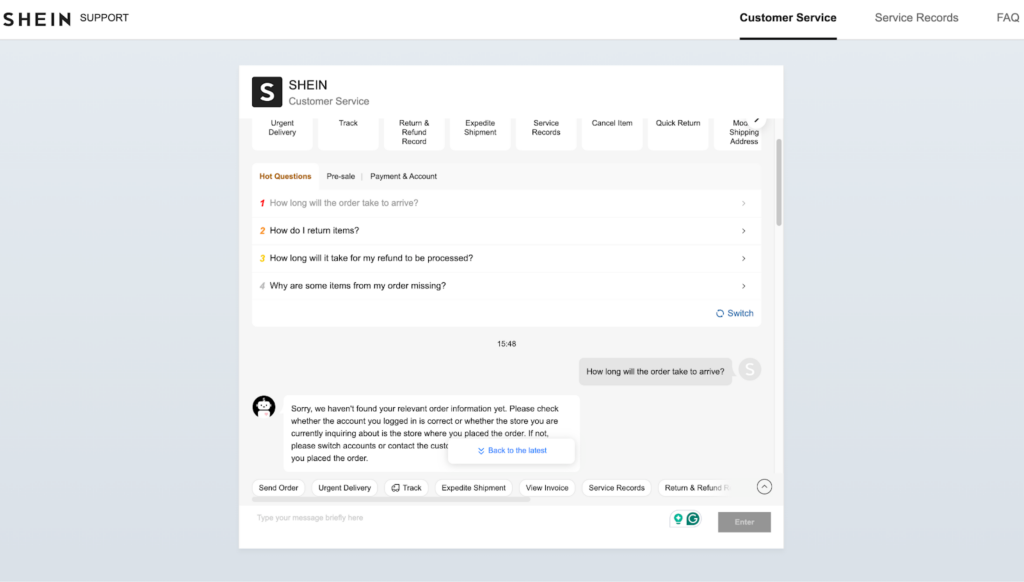
SHEIN does a remarkable UX Design job in its online customer service module for its global website, with an easy-to-scan interface that guides the user throughout commonly asked questions.
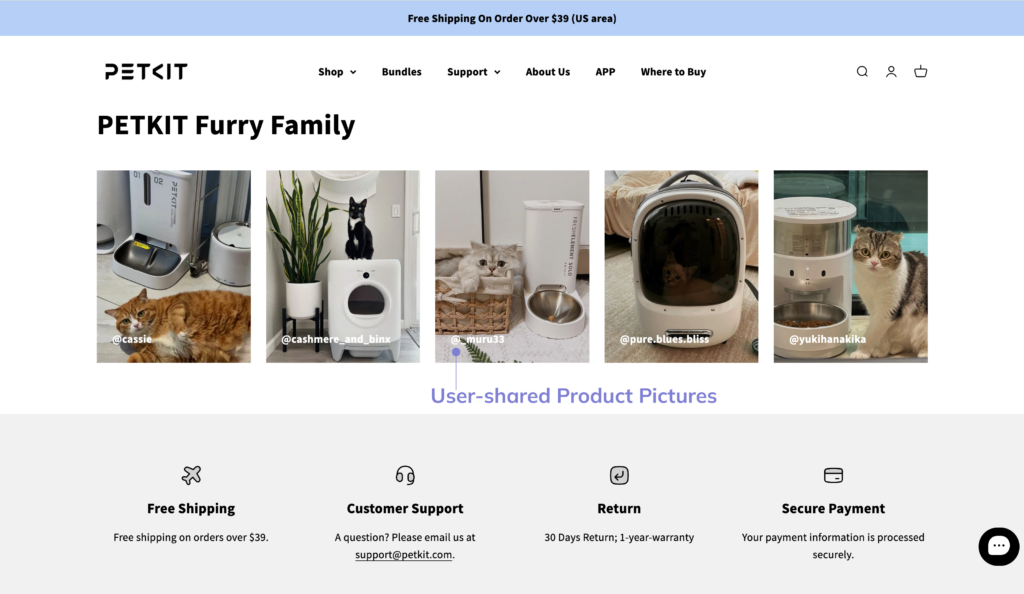
10. Use social media to interact with users
Enhance brand influence and user engagement by actively interacting with users on mainstream social media platforms in the target market, such as Facebook and Instagram in Europe and the United States, and Telegram, Zalo, and TikTok in Southeast Asian countries.
Brands can answer user questions and handle complaints promptly, and enhance user engagement and loyalty through personalized content. UI/UX designers should ensure that social media integration functions are intuitive and easy to operate on the website or app so that users can get in touch with as few clicks as possible.
PETKIT makes great use of social proof
Optimizing your Global eCommerce UI/UX with TMO
User Experience runs through every link of the entire shopping process. By paying careful attention to the entire user flow from shopping and payment, to logistics and customer service, brands can not only improve user satisfaction, but also enhance user loyalty, and ultimately gain long-term competitive advantages in the global market.
As an eCommerce service provider that has long been committed to helping brands expand overseas and localizing for different markets, we are well aware of the importance of international UI/UX optimization. If you are exploring ways to boost your Global eCommerce, check out our User Experience Design Services or directly reach out to discuss your project!
