Nowadays, mobile devices are becoming more and more closely related to our lives. It's not only an equipment, but also a lifestyle. Even we use apps everyday, but actually there is no "rule" for how to design. What we should do is to design from a perspective of users.
Today let's talk about what we should concern when designing mobile apps.
Focus on user habits
Whether the page is beautiful or not is not the only thing that we should focus on. User operate habits is also one of the most important thing should be taken into consideration. For example look for some Mobile User Behavior Analytics - How do They Use Mobile Phones?As an eCommerce developer, we concern about how to meet our customers need. One thing we should take it into consideration is that the mobile users behaviormobile user behavior analytics and find out where should be put the button that can avoid the blind spot.
Take environment into consideration
Each app should find their own position itself. Some factors like time, place and environment can also be important. Imagine that we are looking for a place by using a map app on a noisy road. There shouldn't be a voice function such as speech input. And if an app is usually used in some crowded places, there shouldn't be too much typing.
Reduce access level
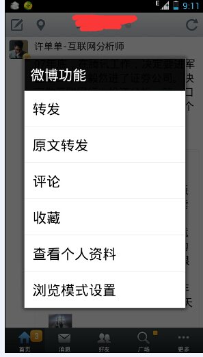
We use some apps because of the convenience. As a result, too much access level may lose users patience. We can choose flat structure if there is too much options like the screenshot below.
Draw a clear distinction
The Pareto principle (also known as the 80–20 rule) states that, for many events, roughly 80% of the effects come from 20% of the causes. In our mobile apps, we should directly show 20% of functions which are most commonly used and hide 80% of other functions.
Respect users
Respect users means that some apps should have an auto-save. For example, without auto-save, if there is no internet, what we type will missing after we click "send". Also for email or other off-line can be cached.
Reduce input
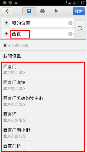
People are getting lazy and typing is not that easy in mobile than keyboard. So sometimes we can try to let users to select rather than type the whole sentence. For example in a map app, it can guess some locations about where we are by using the GPS function.
