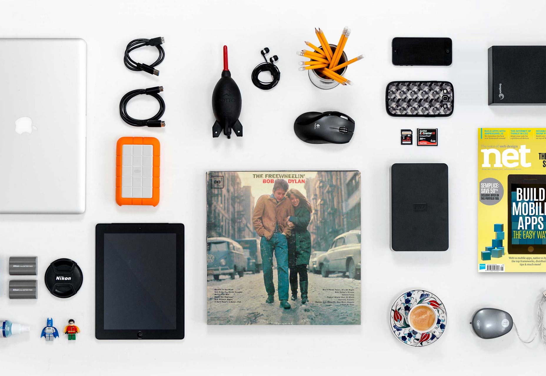
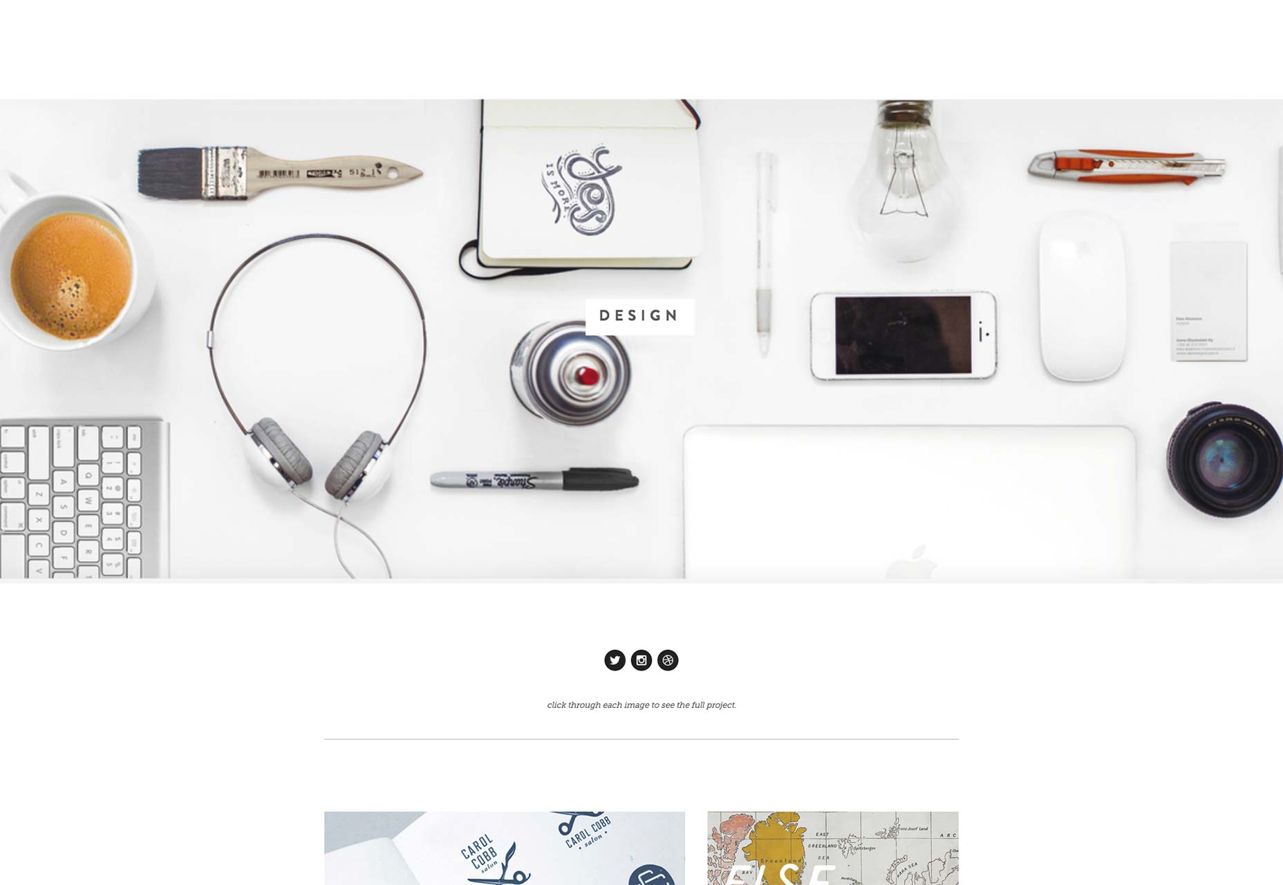
When it comes to web design, image is one of the most important elements. Generally speaking, a good website usually has clear and appropriate images. Today we' like to share how to make use of these images to boost your website design.
1.Huge background images
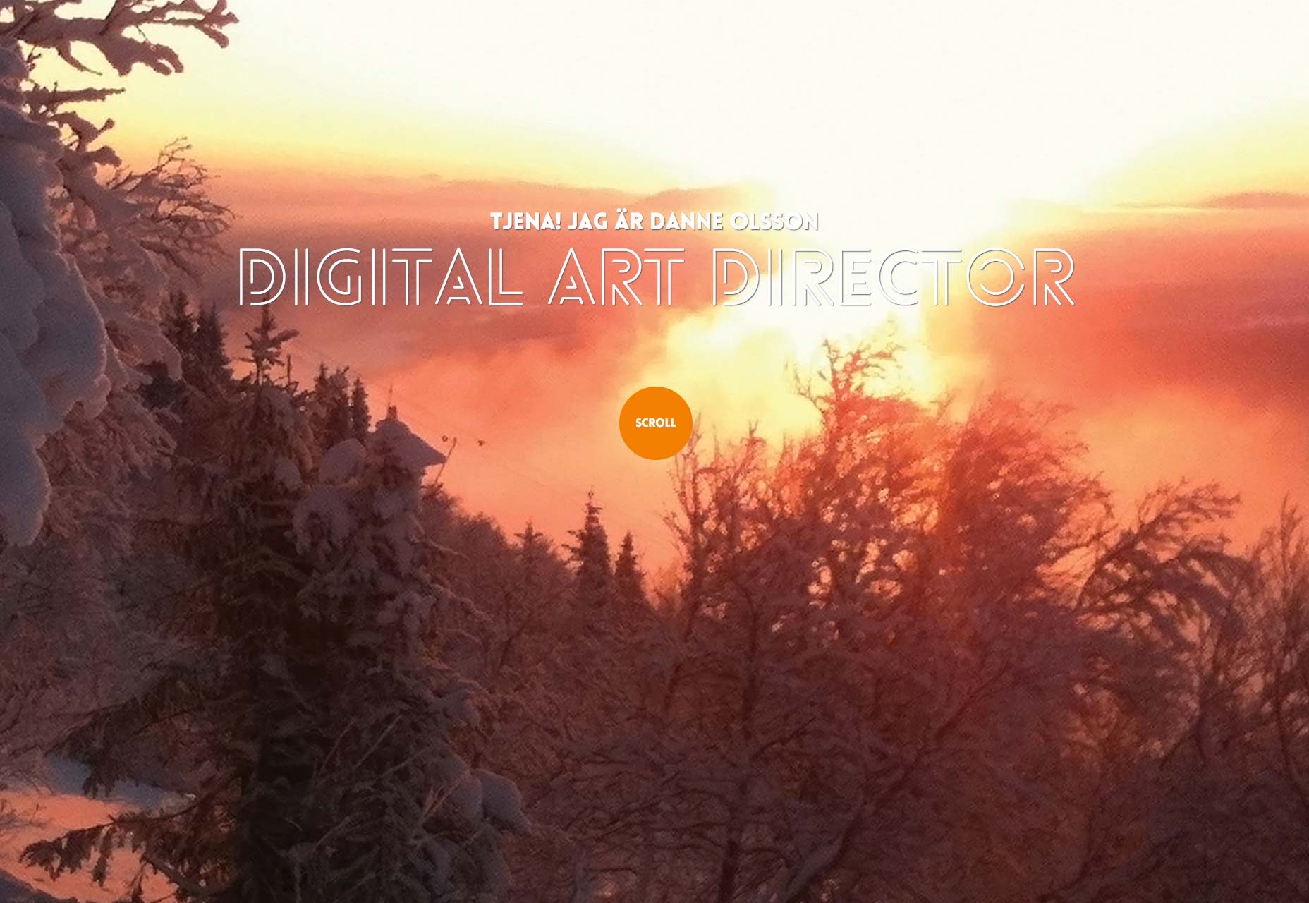
First let's talk about a trend that use huge background images. Though we've ever seen it in many sites, it still really make sense. If your website is used to put some showcases, huge background images could be a good choice. In order to make the site clean, you need to pay attention to the position of the title and characters.
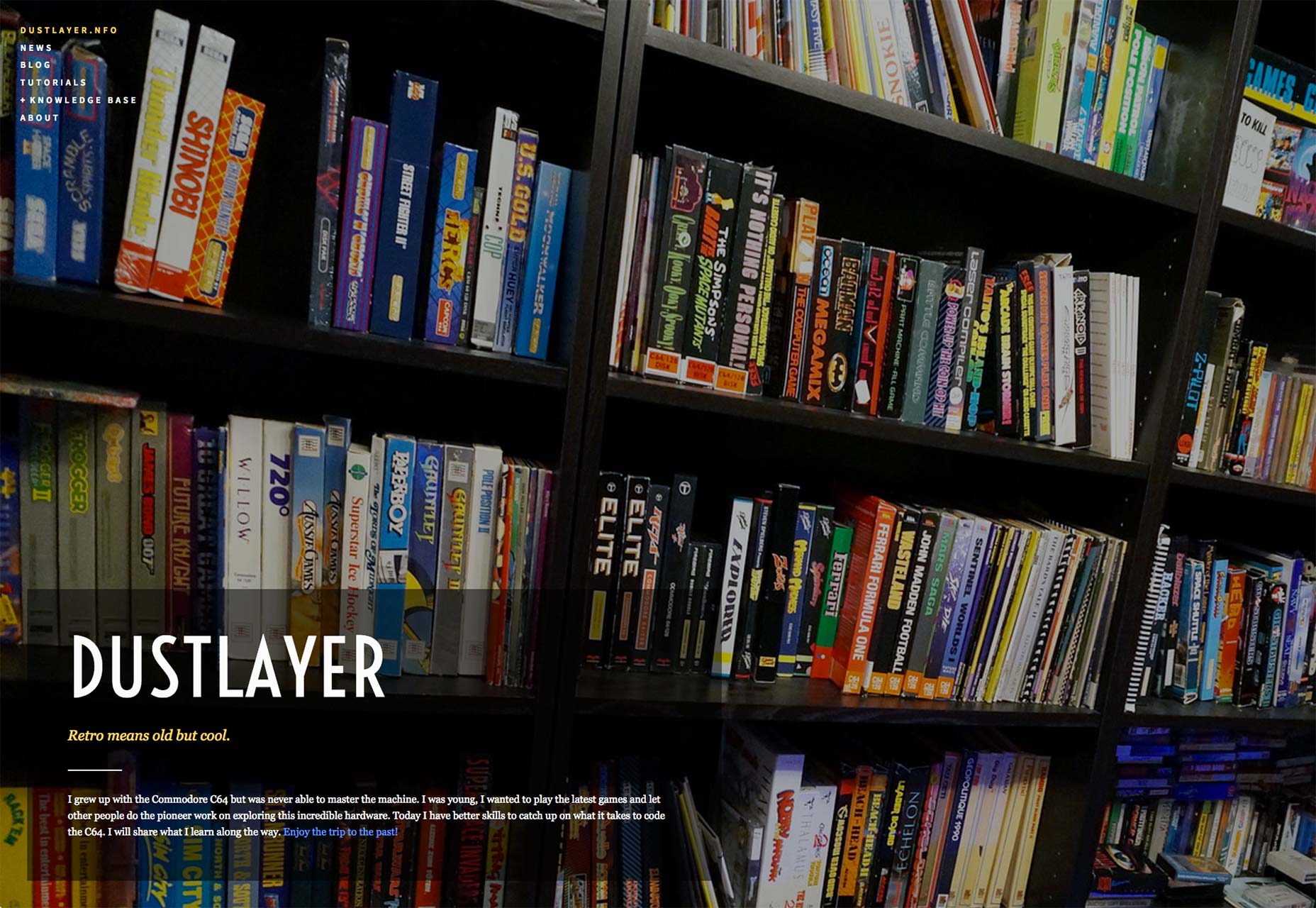

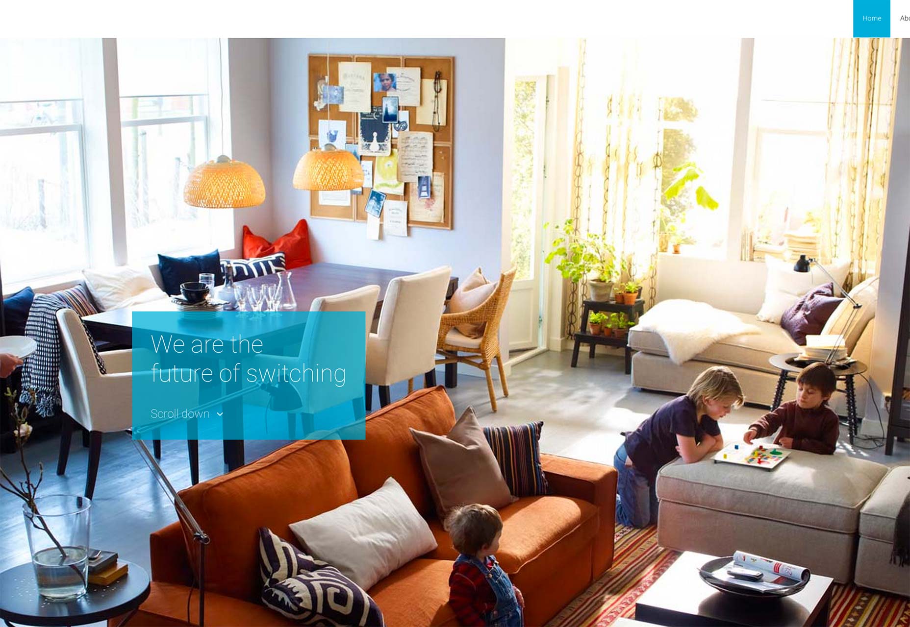
2. Use background images as homepage
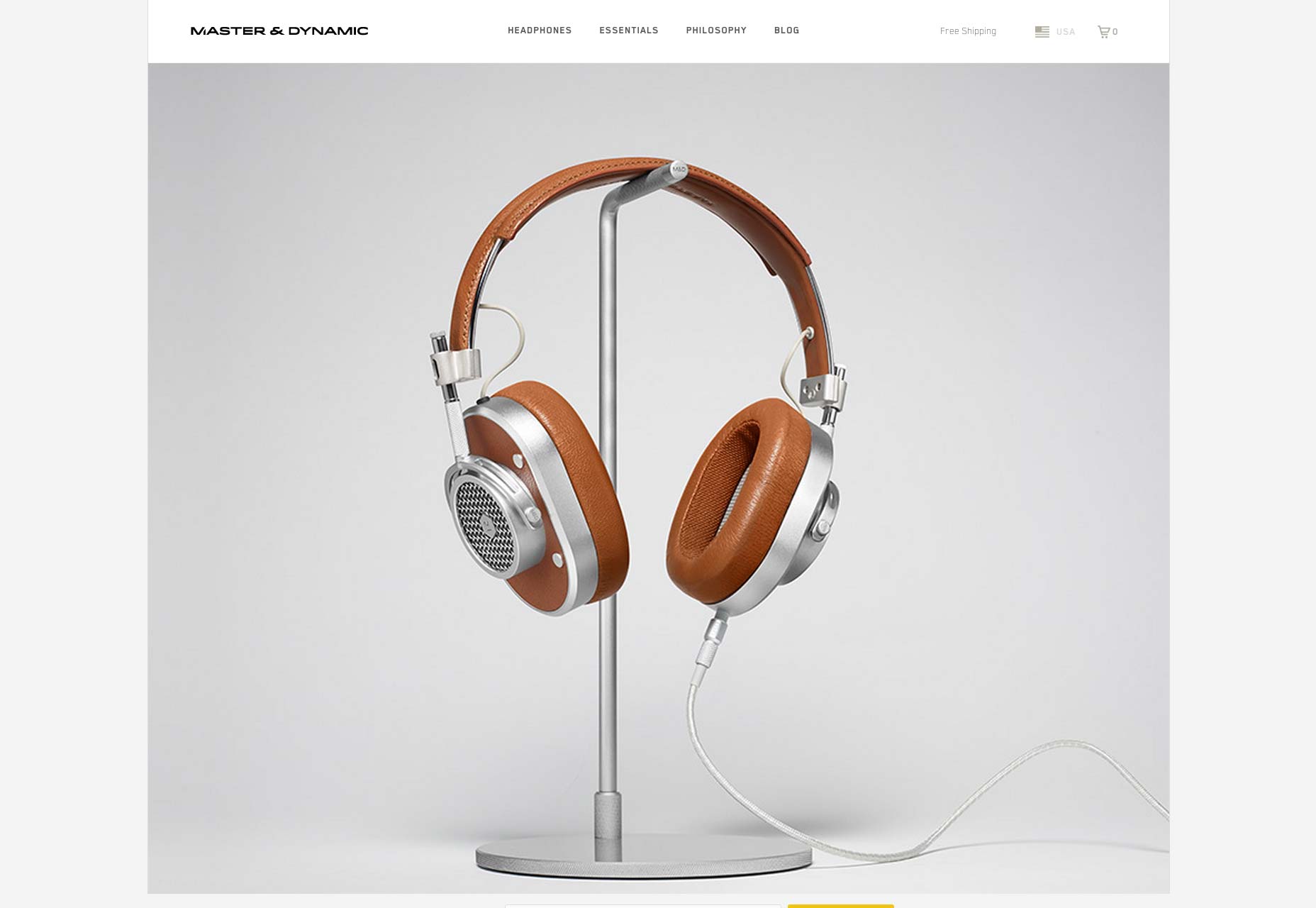
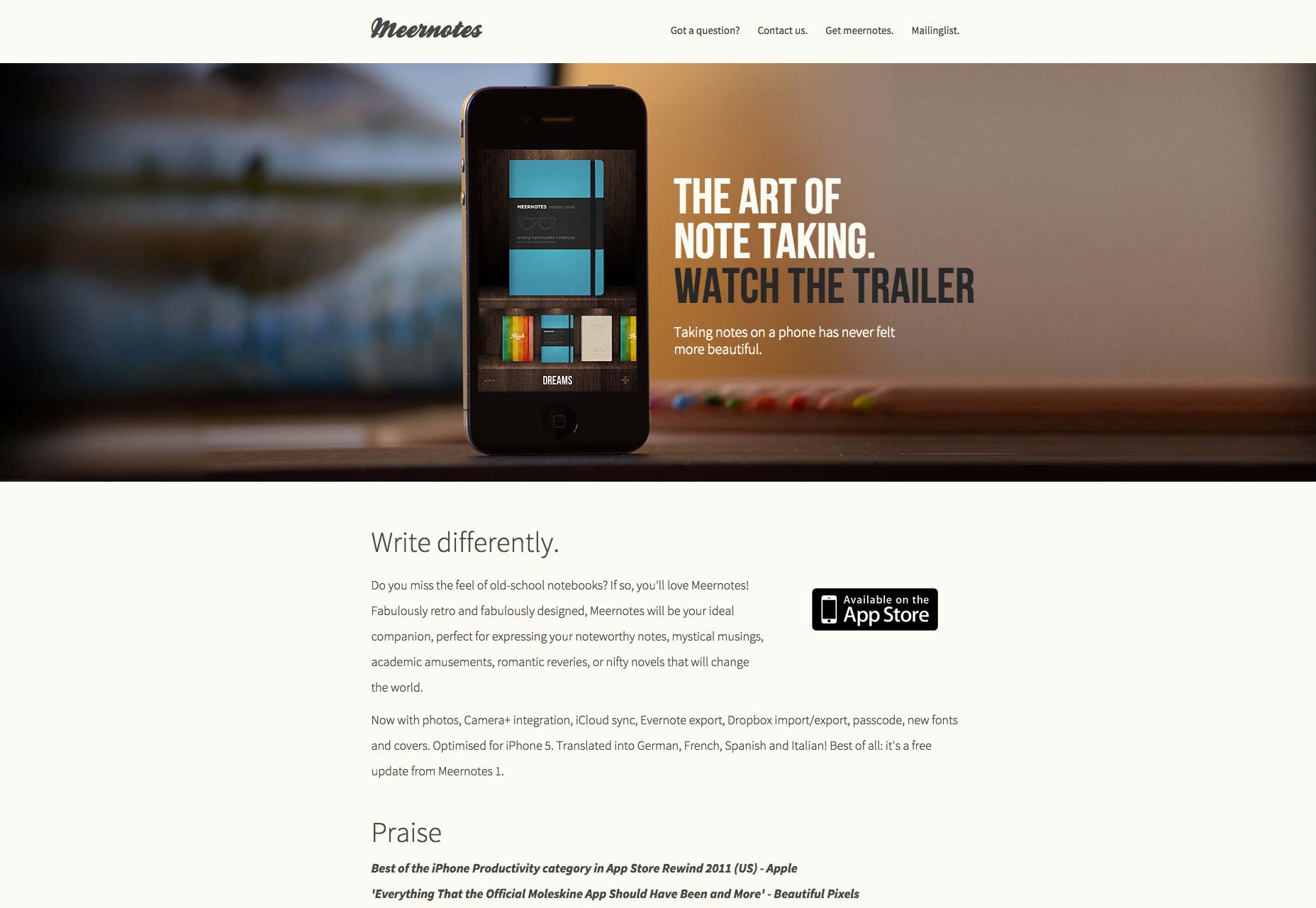
For huge background image, we can also use it for homepage. And normally there is a big product picture in center. We can see some details under it. Furthermore, sometimes background images are blurred, which are realized by controlling the focal length.
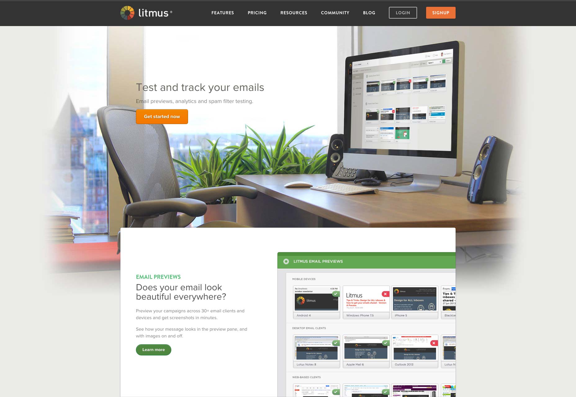
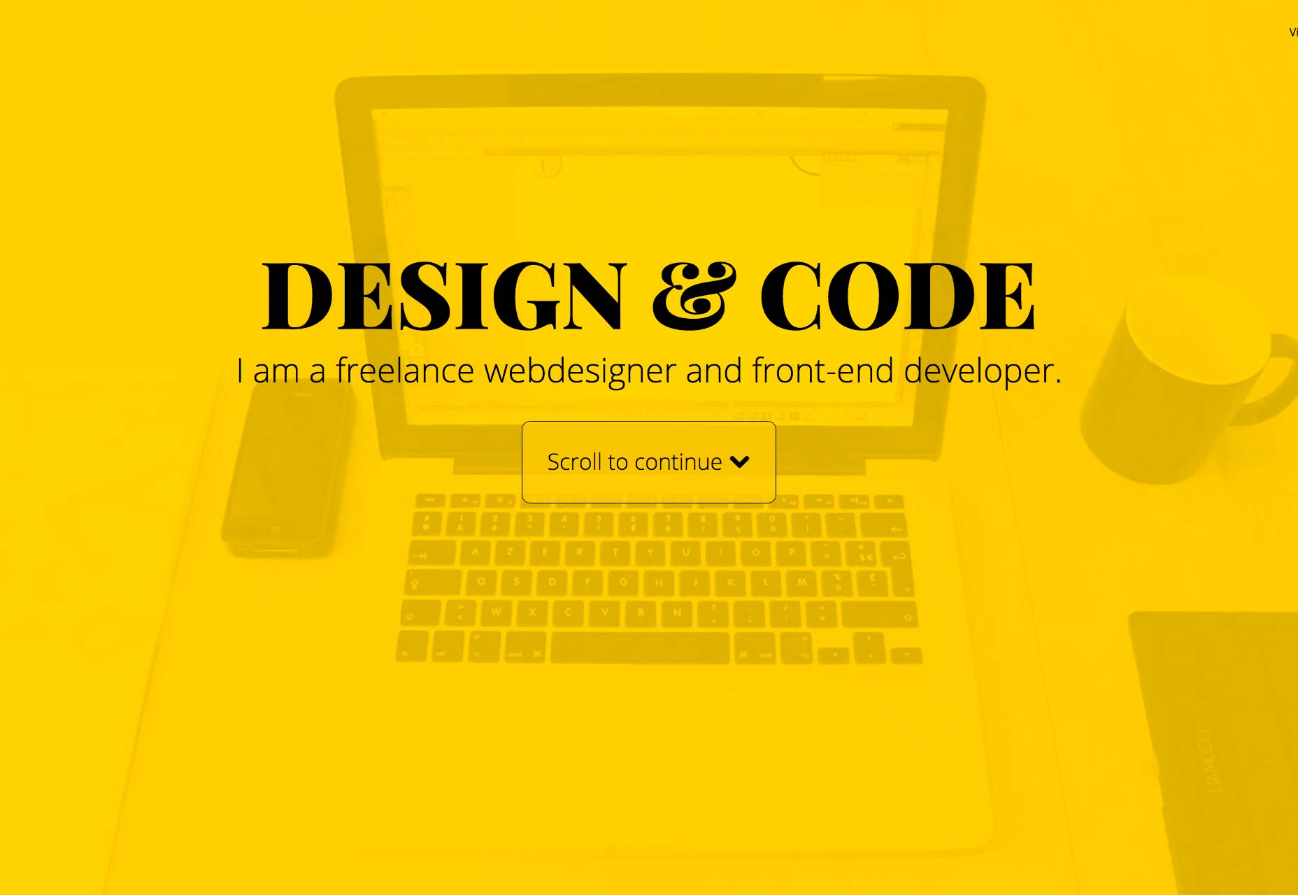
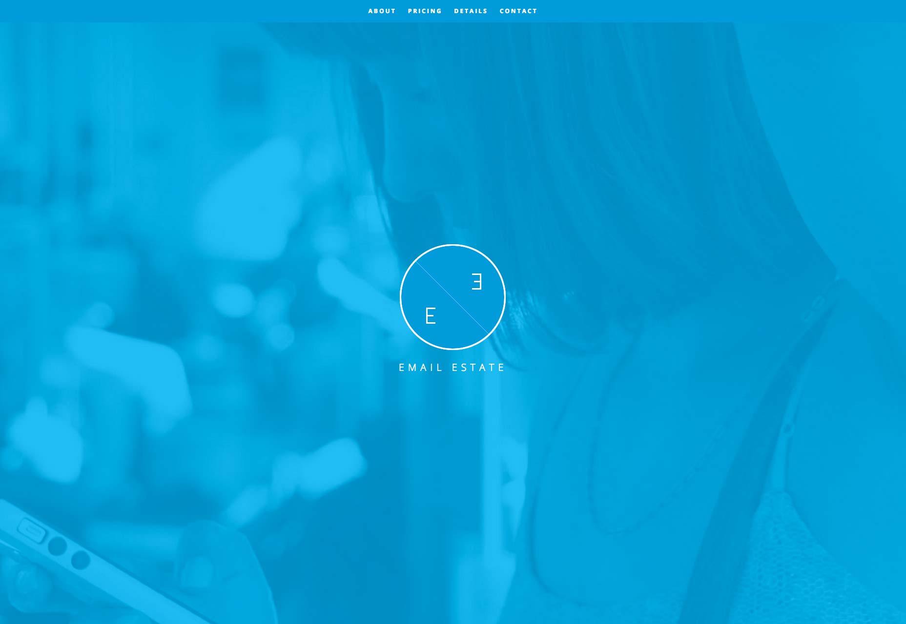
3. Single color
Sometimes we use photoshop to make images more beautiful. But if there are too many elements in one picture, it's difficult to handle them. In that case, we can choose the single color to express emotions. Not only black and white, we can also use other colors for example red can make the site alive, blue can make the site calm.

4. Static Image
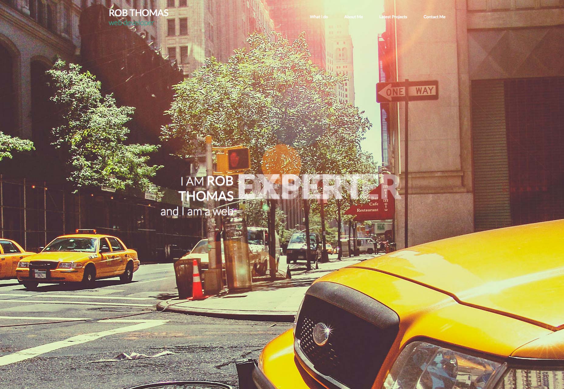
Static images usually make visitors feel comfortable. It is also a latest popular style. Some images are old fashioned and good enough to match wordart.
5. Vertical Style
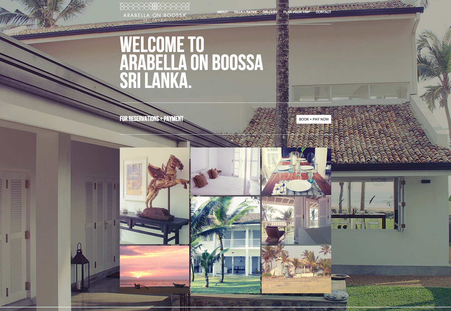
Vertical style means making the object of the site orthogonality. It seem like a special style that only few designers use it. In addition, vertical style usually show some real objects and probably have some hidden meanings.
