eCommerce is a term for any type of business. It can be a major income generator for businesses of all kinds and sizes. If you own a local retail business, eCommerce can be a wonderful complement to your “in person” sales and marketing efforts. But, if you do something in a wrong way, eCommerce can also frustrate you and cause you to lose sales. It can drive potential customers away from your business and directly to your competitors. So it’s critically important that you do eCommerce right if you are going to be successful at it.
And a big part of a an extremely successful eCommerce program is making eCommerce checkout process super simple for your customers. The following steps will help you do that.
1. Don’t Require Shoppers to Sign up Before They Decide to Settle Accounts

Many online stores require shoppers to register before they can checkout. This usually involves supplying a lot of personal information, an email address, and a password. Some shoppers are put off by this — for one thing it's extra hassle when they just want to buy something, and for another they may not like the idea of being put in a "members database".
Do you know that a recent study found that 25.6% of online consumers would abandon a purchase if they were forced to register first. Forcing a user to register in order to complete purchase can make your customers feel that they’re not in control while buying from your store. This increases the chances of Reasons and Solutions for Shopping Cart AbandonmentFor many eCommerce stores, shopping cart abandonment is a a common issue. If you are an eCommerce merchant, reading this article can help you solving the problemscart abandonment by the user.
If you must require your customers to register with a username and password before they make an eCommerce purchase from you, make the setup process simple.
Provide a marketing experience he loves, one that he can’t wait to tell his friends about, an experience that makes him eager to buy from you again and again, and you’ll reap some very nice rewards.
2. Make It Easier For Shoppers To Fix Mistakes

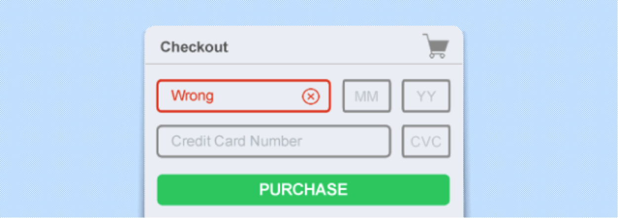
We’re human, and we make mistakes. When we’re online, we tend to be busy and distracted. When we’re making a purchase and filling out even the simplest of checkout forms, it’s easy to mistype a credit card number or forget to include a shipping address. We’ve all done something like this before.
For example, if someone enters only 9 digits for their phone number, they probably just slipped up. But don't wait until the end of the checkout process to tell them that -- alert them right away! Even worse, don't make it impossible to find and understand the mistake you just alerted them to. Mistakes should be in big, bright, bold letters with explanatory text so shoppers don't have to troll through all of the fields to identify which one contains the mistake, and the right way to fix it.
3. Use a secure checkout

Today’s online shoppers are savvy people, trained to look for the additional “s” in their browser address bars, https rather than http, and padlock symbols that tells them that a website is secured – an absolute necessity for an ecommerce website.
A survey by showed that 58% of online shoppers who abandoned the checkout process did so because of security concerns. So what can you do to fight this problem?
If possible, make your checkout form use SSL/TLS (https) so that the customer's details are encrypted when they're sent to the server. This reassures customers that you take their privacy and security seriously. You should always encrypt payment information such as credit card numbers.
4. Give Your Customers Several Different Payment Options At Checkout

Think back to what we said a moment ago about user experience and putting yourself in your online customers’ shoes. Do you enjoy buying from an online merchant that makes the shopping and checkout process time consuming and difficult for you? Of course you don’t!
Neither do your customers. They want you to make it easy for them. One way you can do that is to offer them several options when it comes time for them to pay you. People have different ways they prefer to pay. If Visa is the only credit card you take, and a portion of your potential customer base prefers American Express, chances are you will cost yourself quite a few sales.
If some of your prospects refuse to use credit cards and you don’t accommodate them, chances are it will cost you. To get more sales from this group, accept PayPal and debit cards. It’s not necessary to offer every possible method of payment, but be aware of what methods your target audience prefers and offer those.
5. Prominently Display Reassuring Information in the Checkout
Adding a product to a cart requires very little commitment — it's easy to walk away. Showing a summary throughout the checkout of the basket – what is being purchased and how much it costs – is very reassuring. Customers like to double-check what they’re buying and how much they are paying. And it is always good to remind the customer of any savings as an additional incentive to complete the purchase.
Place reassuring information on the checkout page to encourage your shoppers to commit to buying:
- Your physical address. Shoppers want to know exactly where a merchant is located.
- A contact phone number. This should be toll-free if possible. It gives shoppers the reassurance that, if there's a problem with their purchase, they can always pick up the phone and call you.
- A money-back guarantee. If possible, offer a 100% refund, no-questions-asked, money-back guarantee on all purchases. Not only does this reassure the shopper that they can get their money back if there are any problems, but it also shows them that you're committed to the quality of your products and service.
- Links to your privacy statement and security information. This reassures the customer that the information they enter in the checkout is safe.
Interested in our blog? TMO Group Shanghai is an eCommerce technology provider. Send us an email about your inquiry!


