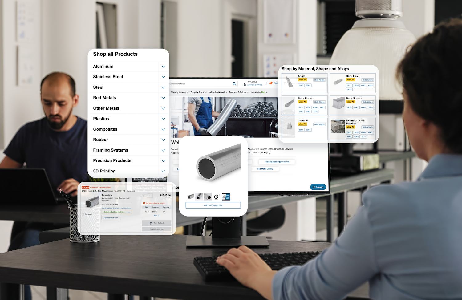
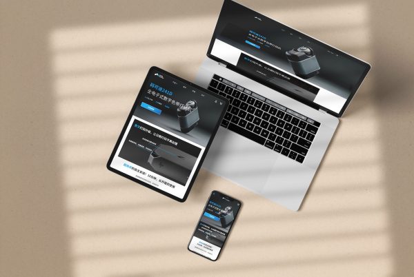
All of us are perhaps familiar with the B2C eCommerce user interface (UI) / user experience (UX) design since it surrounds us every day and everywhere. All websites and app endeavor to provide the best UI / UX design to provide the most pleasant shopping environment and thus maximize the conversion rate. On the other hand, B2B eCommerce will have different functional features because of the business nature. At the same time, enterprise companies also realize the importance of UX design – B2B eCommerce sites are no longer some catalog-liked displays or order form system but becoming more user-friendly and getting closer to their consumer counterparts.
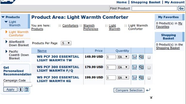
B2B eCommerce can no longer be catalog-liked display.
Good design and favorable functions mean happy users, less support and training, and a streamlined conversion process. There are special business natures for B2B eCommerce so let's deep dive into special features that a B2B site should have, with great examples of brand website and platform to evaluate.
B2B Feature 1: Registration and Gated Access
As a B2B business, you should only want to show the wholesale price to specific, approved, and recognized customers. Moreover, there may be different pricing structures and payment options available to different buyers' accounts. Sometimes, when the corporate is unwilling to show the full catalog to the public and other competitors, she can apply this closed login system.
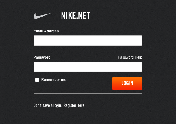
Closed log-in on Nike.Net
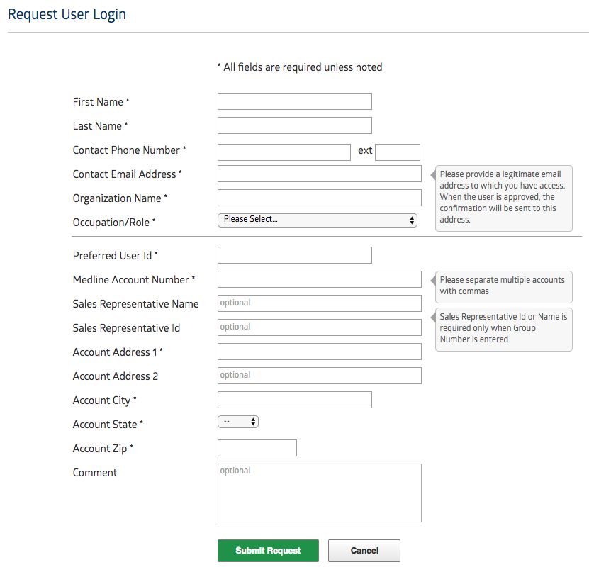
Business details are required to apply for an account at Medline.
Normally for B2B sites, registration is mandatory. Users are required to gain the merchants' approval after filling in certain business information, including company name, address, contacts, business license, tax information, etc., to verify users' identities. Once customers have logged in, they can see products, prices, terms, order-tracking information, and, potentially, even pay for offline orders.
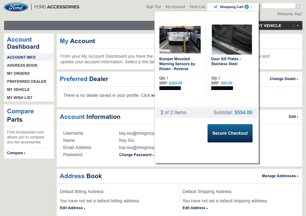
Account Dashboard on Ford B2B Accessories site - Order information, shopping cart, etc. can be viewed
B2B Feature 2: B2C-Liked design
Are you expecting the streamlined and easy-to-use interfaces of a B2B eCommerce site? The line between B2B and B2C eCommerce is blurring. It can maximize user satisfaction when the website is easy to navigate and provides a personalized experience to find what they need quickly and easily.
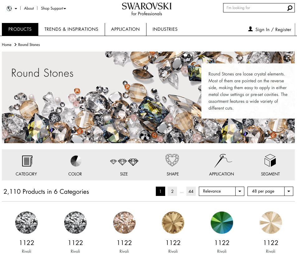
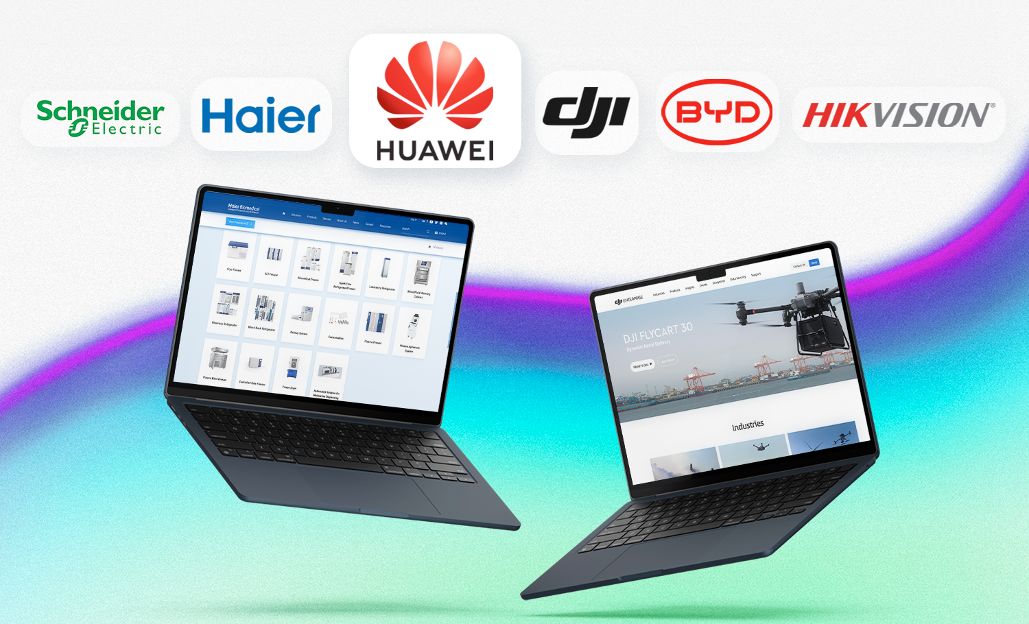
Swarovski B2B jewelry and gemstones eCommerce have a favorable UI design and user-friendly classification and sorting functions. It simply looks like a B2C retail website.
B2B Feature 3: Complex Pricing System
Unlike B2C commerce, products and services in the B2B field may be tailor-made and customized to fit the corporate needs. There may also bulk quantity discounts or certain corporate discounts from the sales representatives. Thus, the pricing of B2B is relatively complex, and it is hard to display to all customers. Most of the time, the price is hidden and requires a secured login or 'request for quote' from the sales rep to access the pricing information.
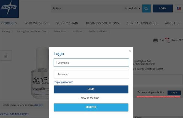
Login-in to check the stock availability and price at Medline
On some eCommerce platforms, there will be a tier-price to encourage bulk orders. With the larger order, the discount will be greater.
Some distributors can see wholesale price, tax-inclusive price, discount rate, and agreement price after log-in into the platform.

When possible, try to show the exact price targeting different customer segments or different product/service packages. B2B customers could get a price range for budgeting or approval before the precise quotation is confirmed. The pricing shows can also act as a customer filter - allowing the sales team to distinguish whether the coming leads can afford the product/service offerings.
B2B Feature 4: Product Specification
The B2B purchase is a long and complex decision-making process. It rarely looks like the B2C impulsive buying. Perhaps, the purchasers need to involve multiple functional job roles, management, and decision-makers for the approval. Information and options sharing among team members will be quite common for comments, justification, and approval. It will be much easier for the purchaser to gather product information with 'one-click,' probably into a PDF format, which can be easily shared among the stakeholders.
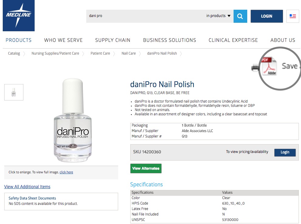
One-click to acquire PDF product specification
It will also facilitate the purchasers' work if there is auto re-order when the item is consumed frequently. This can alleviate the routine procurement as well as make your future order amount stable too!
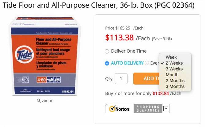
Auto-reorder Options
B2B Feature 5: Quotation Management
A core feature of B2B (and what the buyers prefer) is the bargaining process. The procurement will not recognize the stated price for the first time but negotiate with the sellers. The quotation management will clearly record the results of the price bargaining and document every changes for future reference. The importance of quotation management will be realized when there are more and more orders and even high personnel turnover, whether at the customers or sales rep side. All bargaining processes will be well recorded and be referenced in the future.
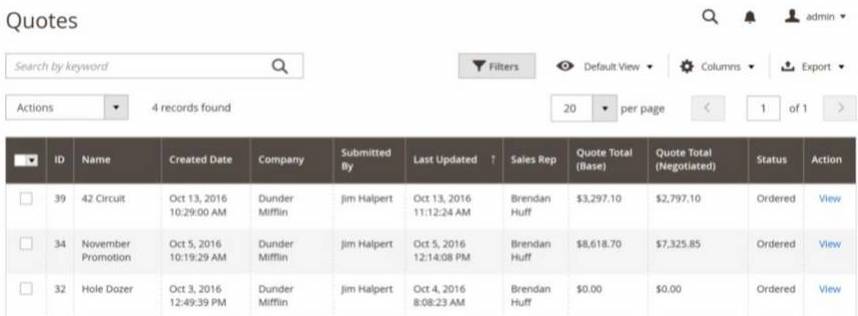
For the payment process design, depends on the procurement process, a deposit or downpayment is usually required when the order is placed. After the product sample or the first phase of service is delivered, both parties could easily trace and process the remaining payment and check the status online.
Summary
The user experience of B2C has been mentioned for quite a long time while B2B is finally on the right track. Apart from those common UI techniques, you should notice that the site can support a complex buying and decision cycle with content. Clear information of products with case studies stated could also facilitate the decision-making process. Well-tracked quotation management and user-friendly UX help buyers find products that best match with company needs.
