51% of mobile users used their mobile devices as their primary Internet source, compared to desktop (42%). Therefore, it is important that your mobile site, also known as “Compared Native App and Web App DevelopmentYou find yourself standing in from of a roadsign with "Web ap" and "Native app" on it, here are the upsides and downsides of either way.web apps” are for all users, regardless of the device or screen size they happen to be using. You don’t want to make users work to find what they need or be frustrated by the experience of using your site.
How to define Compared Native App and Web App DevelopmentYou find yourself standing in from of a roadsign with "Web ap" and "Native app" on it, here are the upsides and downsides of either way.a good web app? Good web app makes you forget desktop; In contrast, bad web app makes you want to ditch your phone and switch back to PCs immediately. Ladies and Gentlemen: We, TMO Group present you the first “Golden Raspberry Awards of Web Apps”, which hopefully can help you stay away from these.
The “She Wasn’t Ready” web app award Nominees:
The web apps with the “Welcome to our web app but honestly we’re not expecting anyone to come so why don’t you go elsewhere” mindset. Poor attitude will definitely draw visitors away and not coming back.
Meet Your MX:
A promotional website for the Almost Human TV series.
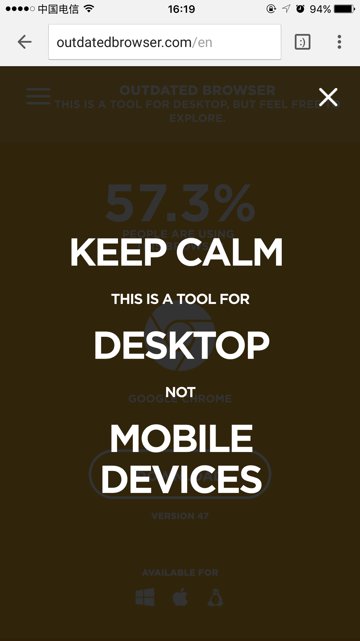
Outdated browser
A simple tool to identify and upgrade old browsers.
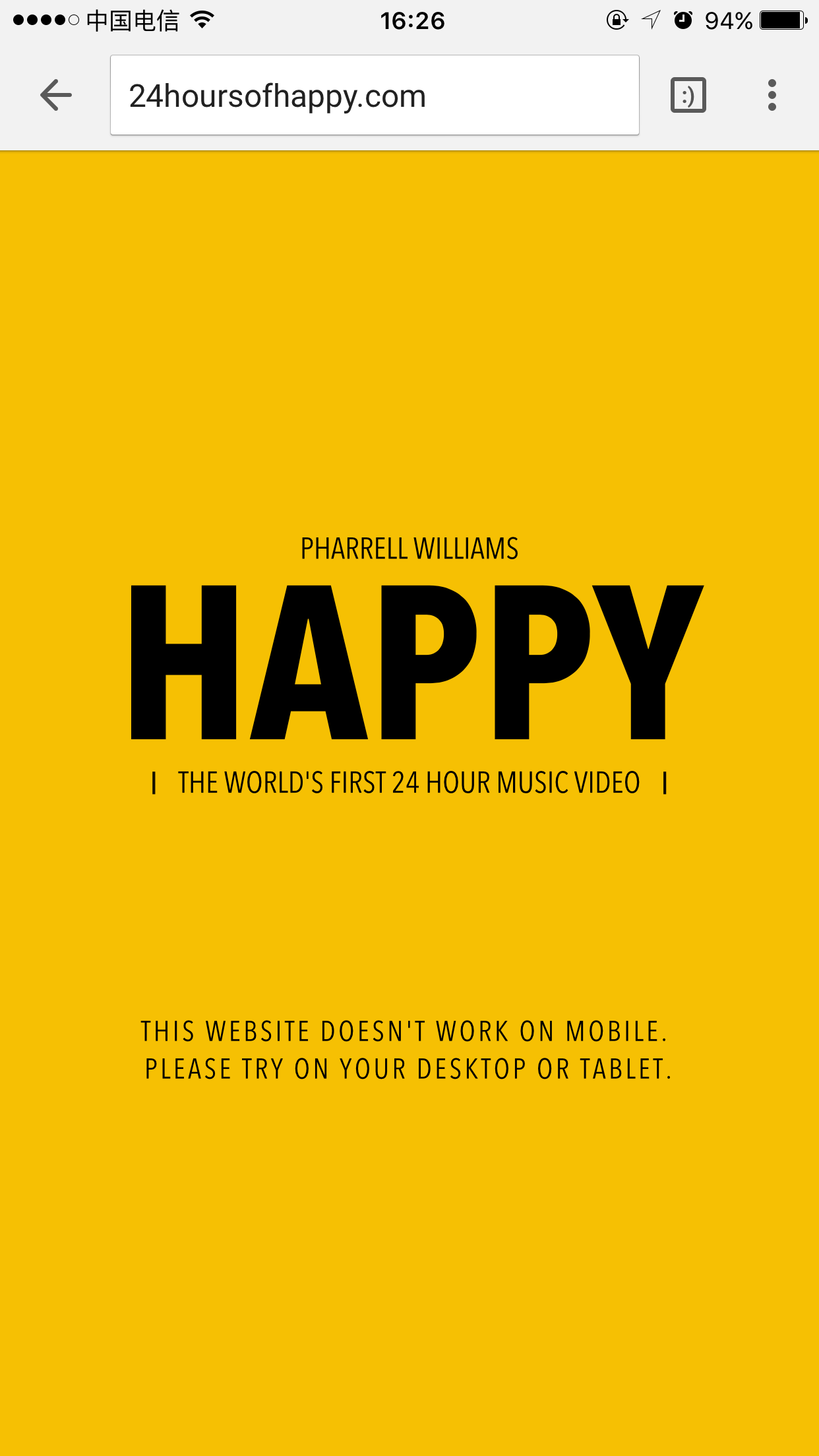
24 hours of happy:
The 24-hour version of "Happy." Pharrell Williams debuted the video for his pop single.
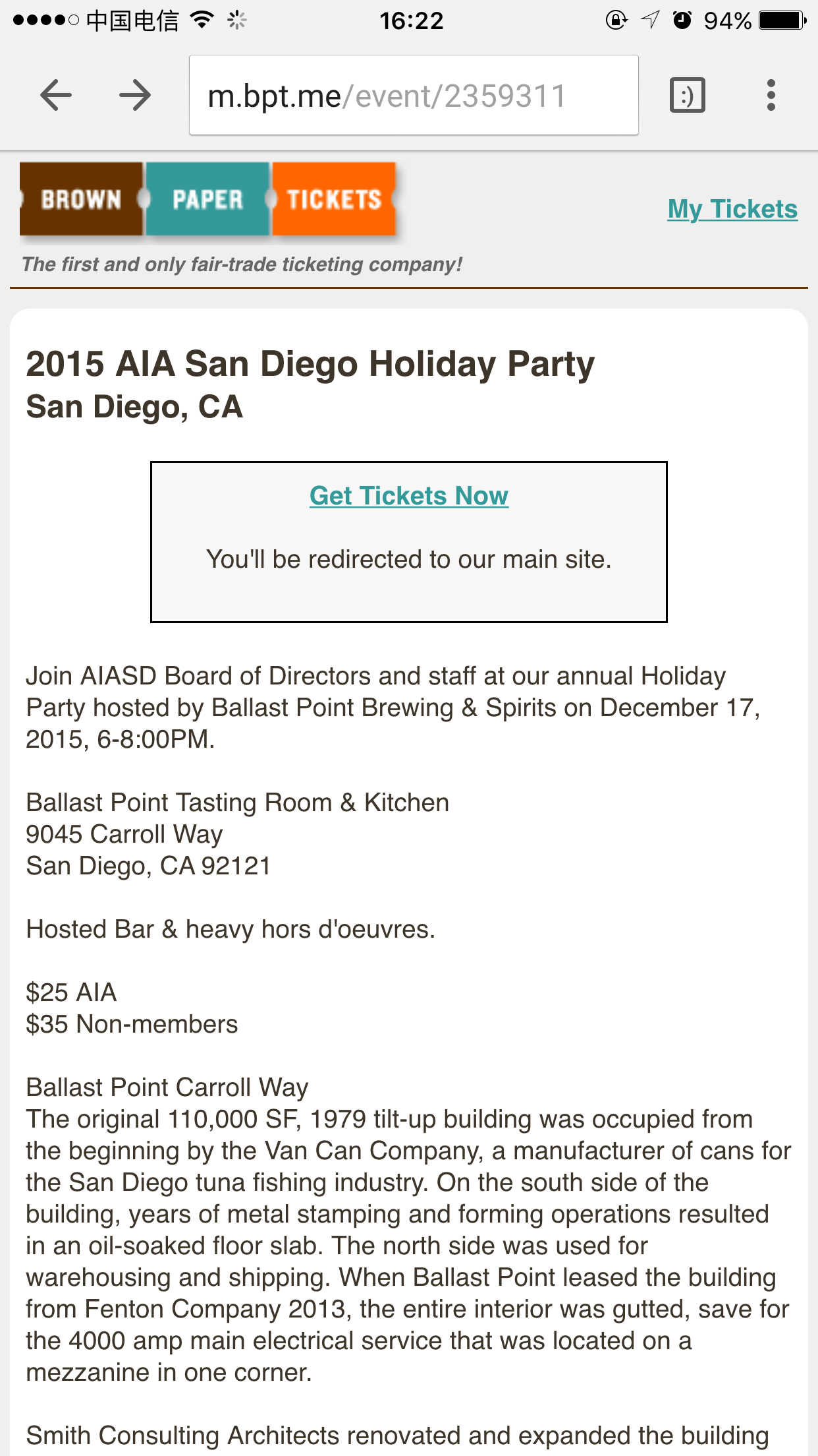
Brown Paper Tickets
An international online ticketing service based out of Seattle, WA
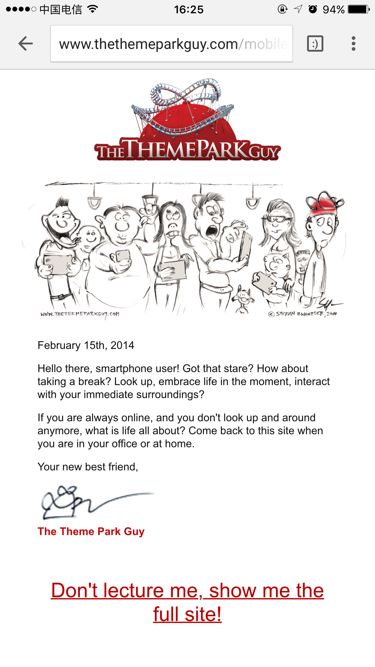
The Theme Park Guy:
Personal site of Stefan Zwanzger, a guy who Spends Life Traveling the World Visiting Theme Parks
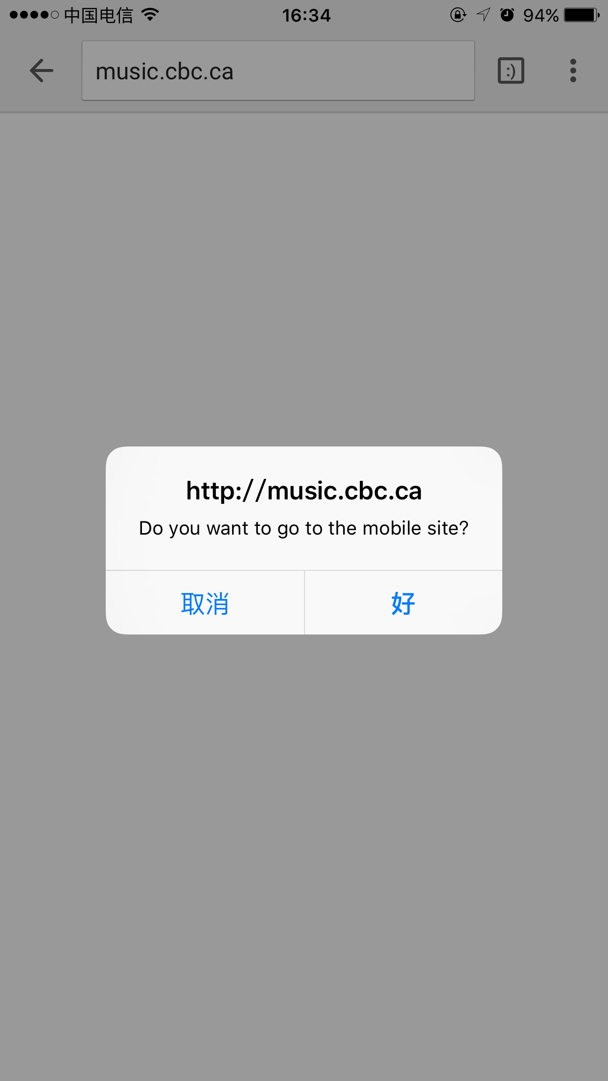
CBC Music
Music page of Canadian Broadcasting Corporation
The “She Wasn’t Ready” web app award goes to: The Theme Park Guy
I respect this dude for spending time crafting words specifically draw mobile users away. Sorry other nominees but he has the “must win” attitude.
The “Fail to Design for Device” web app nominees:
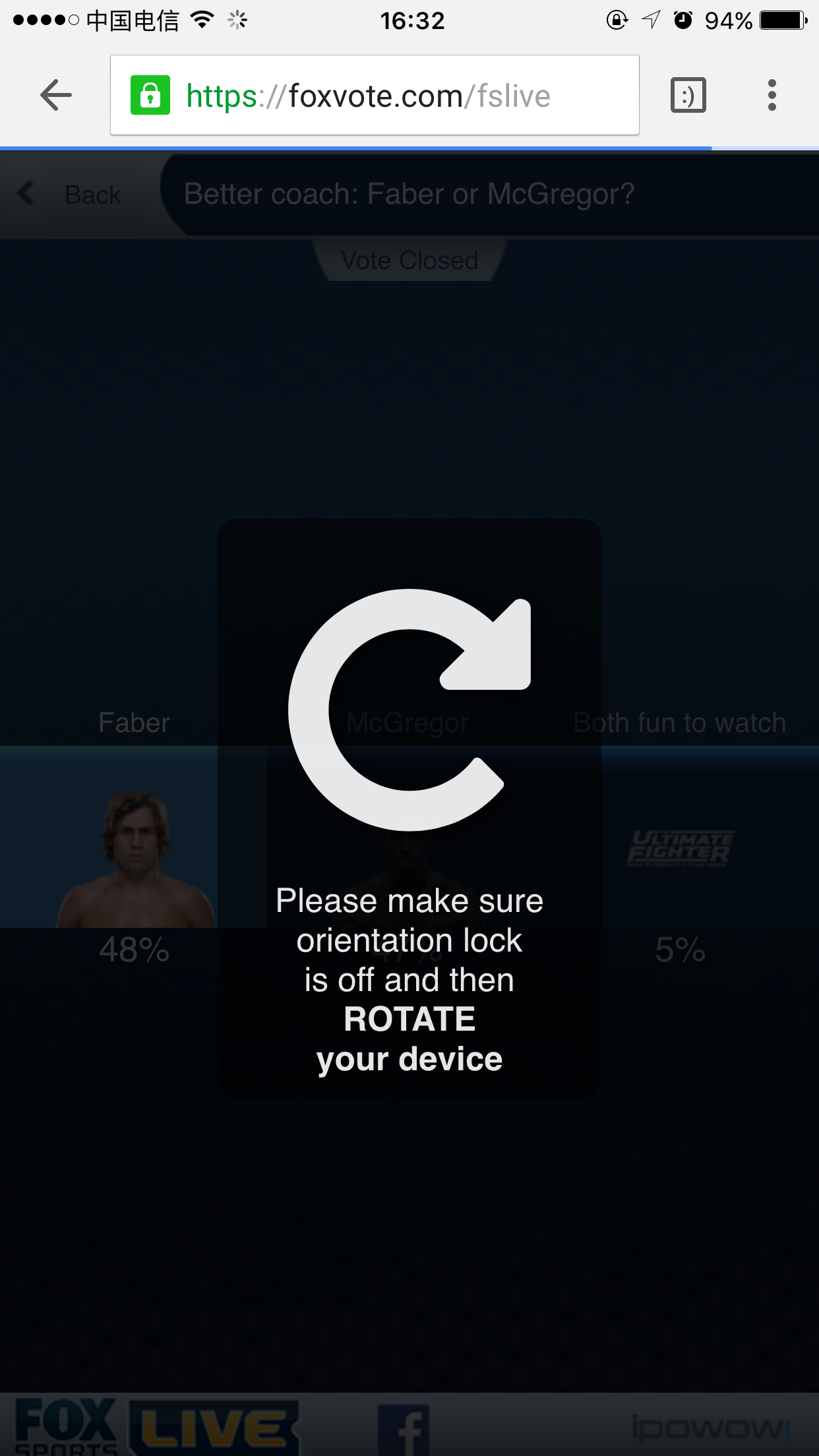
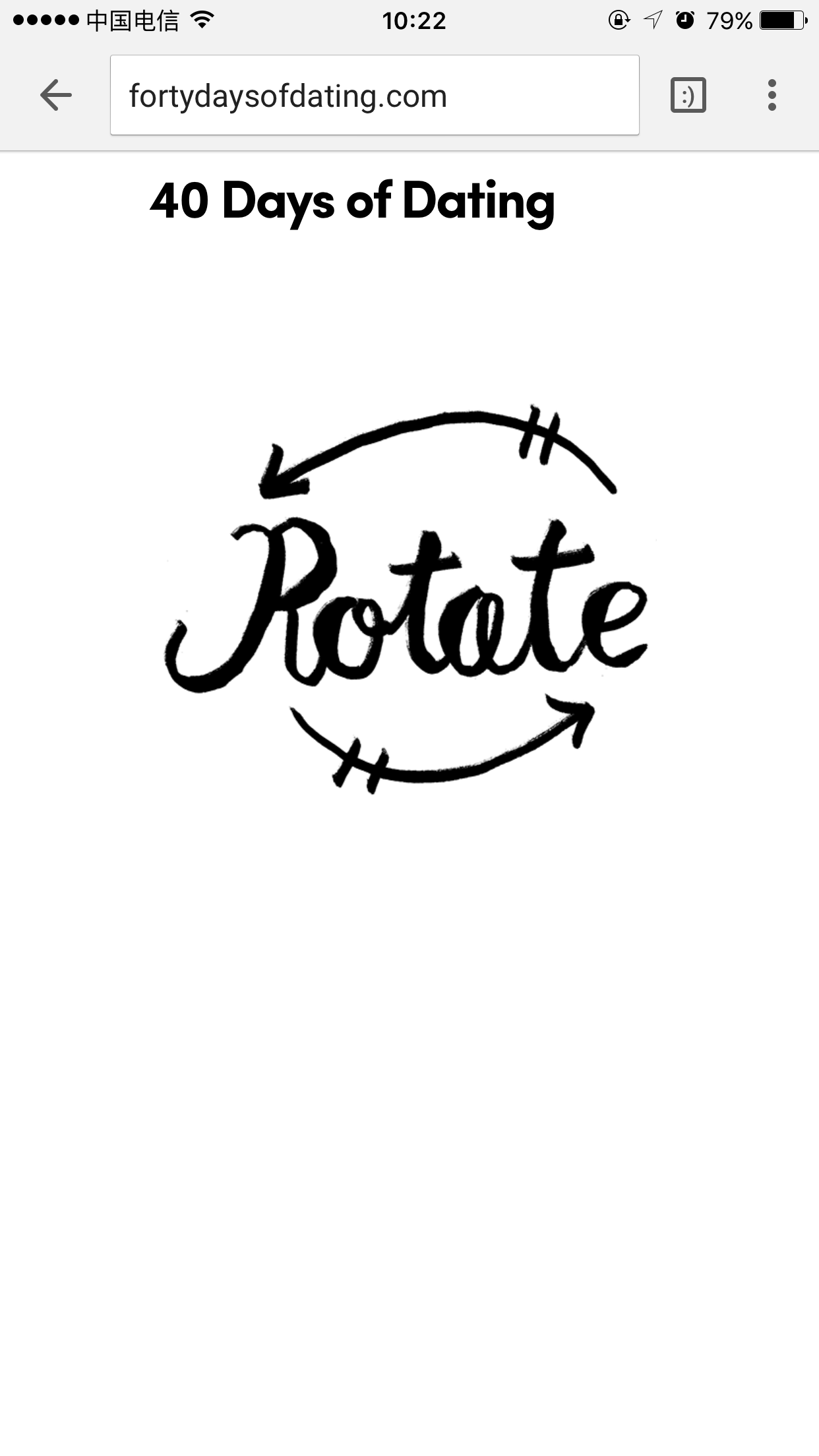
Web app aims to design for device orientation. If your website is still landscape while most smartphones are portrait, your contents would be too small for users to see, and more trouble will occur.
Fox vote
Voting website for FOX’s show: So You Think You Can Dance
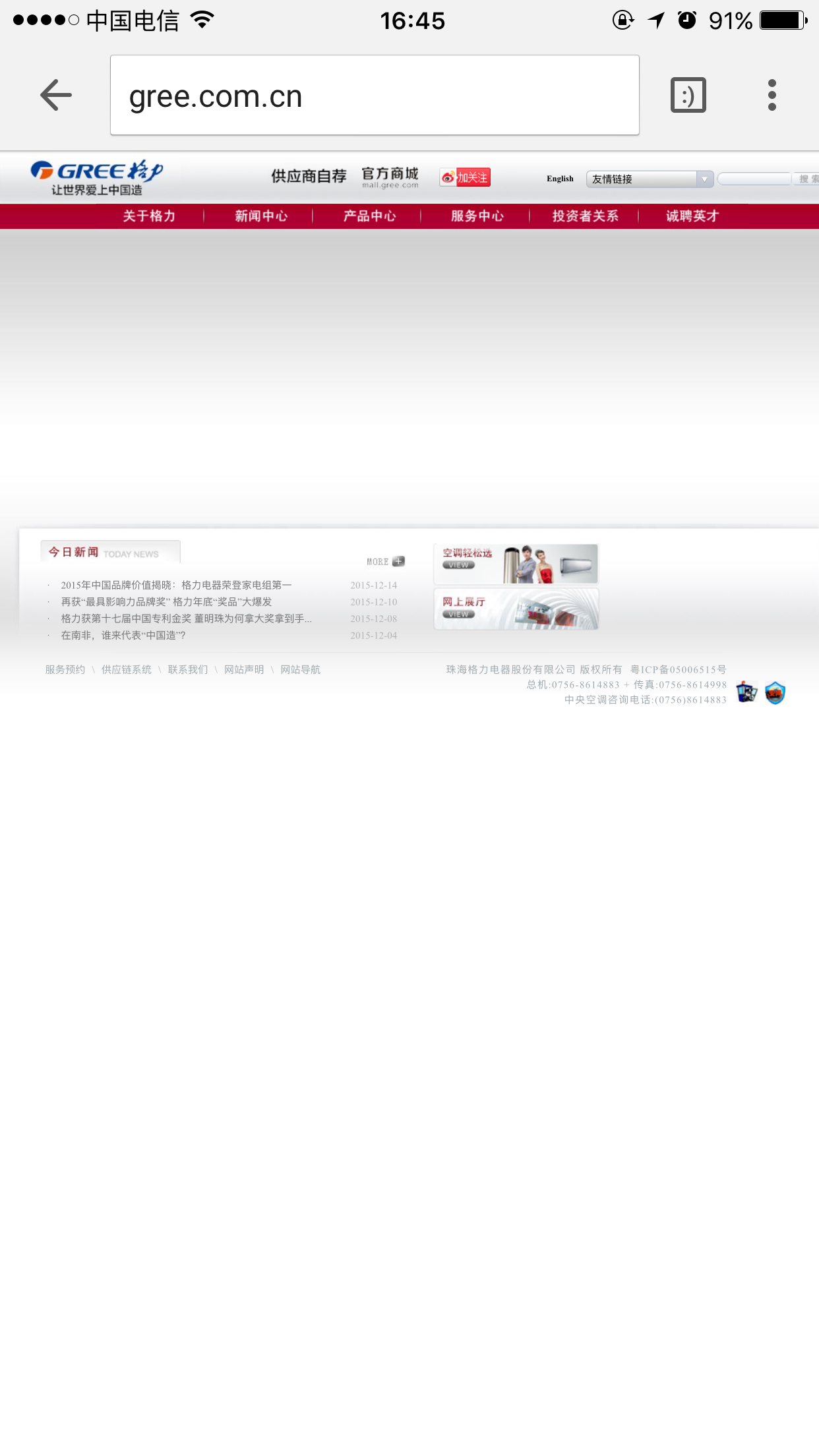
Gree.com.cn
A Chinese major appliance manufacturer
40 Days of Dating
The “Fail to Design for Device” web app award goes to: Fox Vote
Honestly, I can see corporates like Gree not paying attention to web apps, since they may not have so many traffics via mobile. But not you Fox Vote, because you’re counting on this web app when your show is on air.
The “Poor Design” web app award Nominees:
Speaking of users, we don’t ask for beautiful designs, but at least show us a little effort on design end. With all due respect, you need a designer…
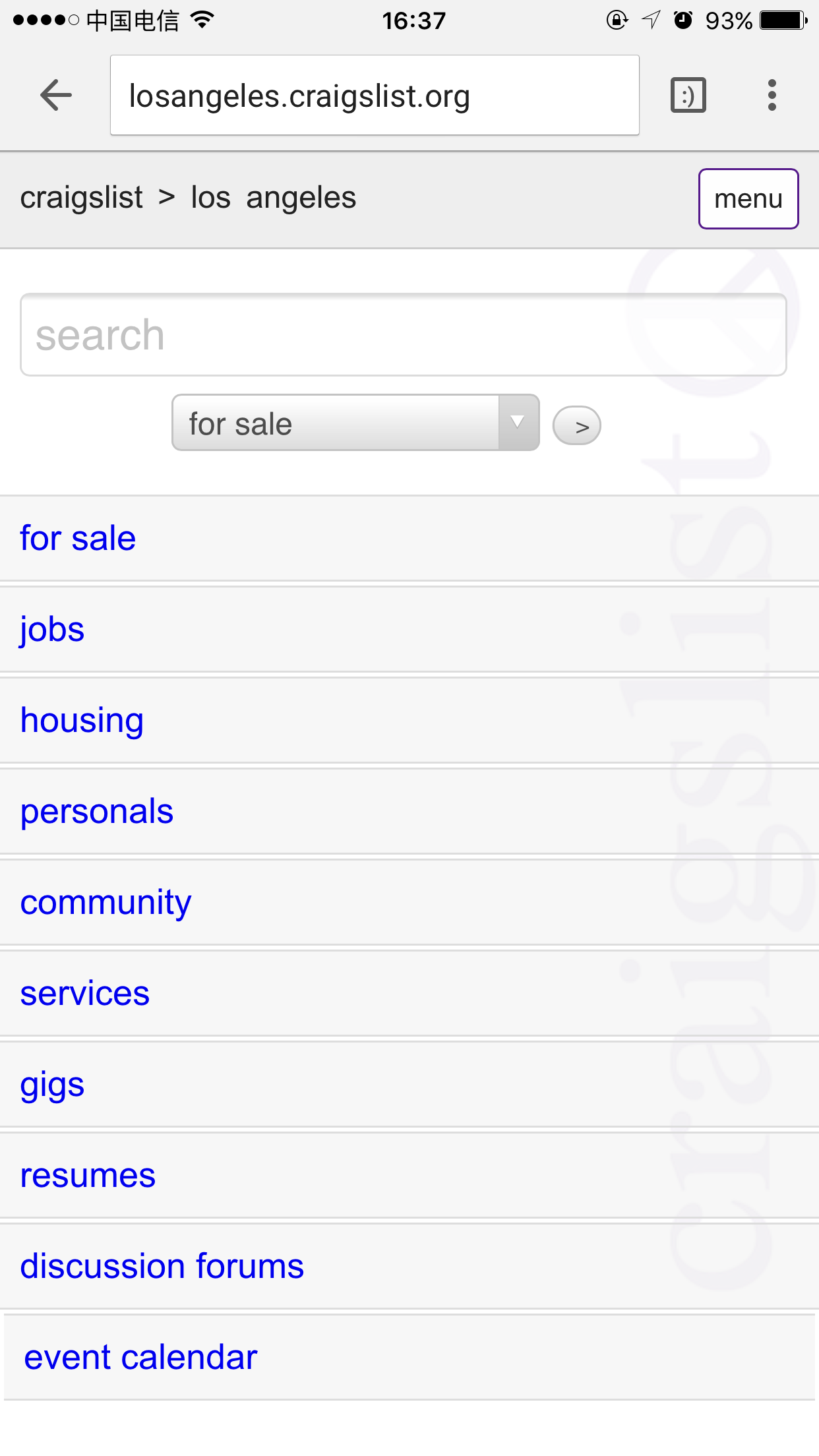
Craiglist:
A classified advertisements website with sections devoted to jobs, housing, personals, for sale, items wanted, services, community, gigs, résumés, and discussion forums.
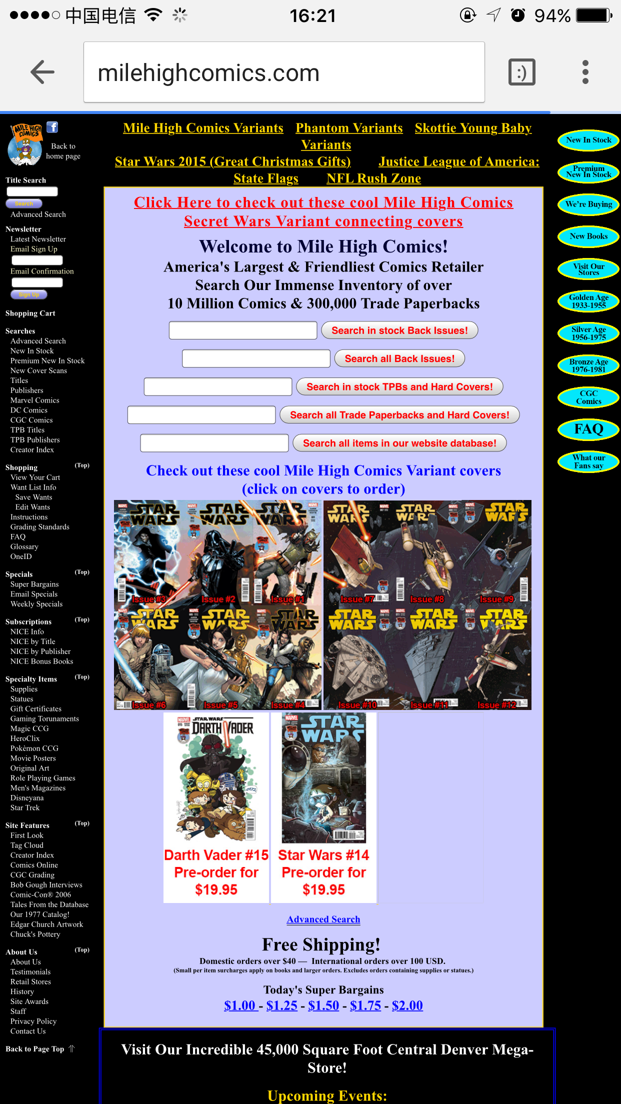
Mile High Comics
Mile High Comics is an online retailer and a chain of three Colorado comic book
The “Poor Design” web app award goes to: Craiglist
Craiglist was founded in 1995, and their design stays in 1995 ever since. It’s kind of funny because Craiglist can probably afford a million designers to work for them, but they just chose not to.
The “Unthoughtful” web app award nominees:
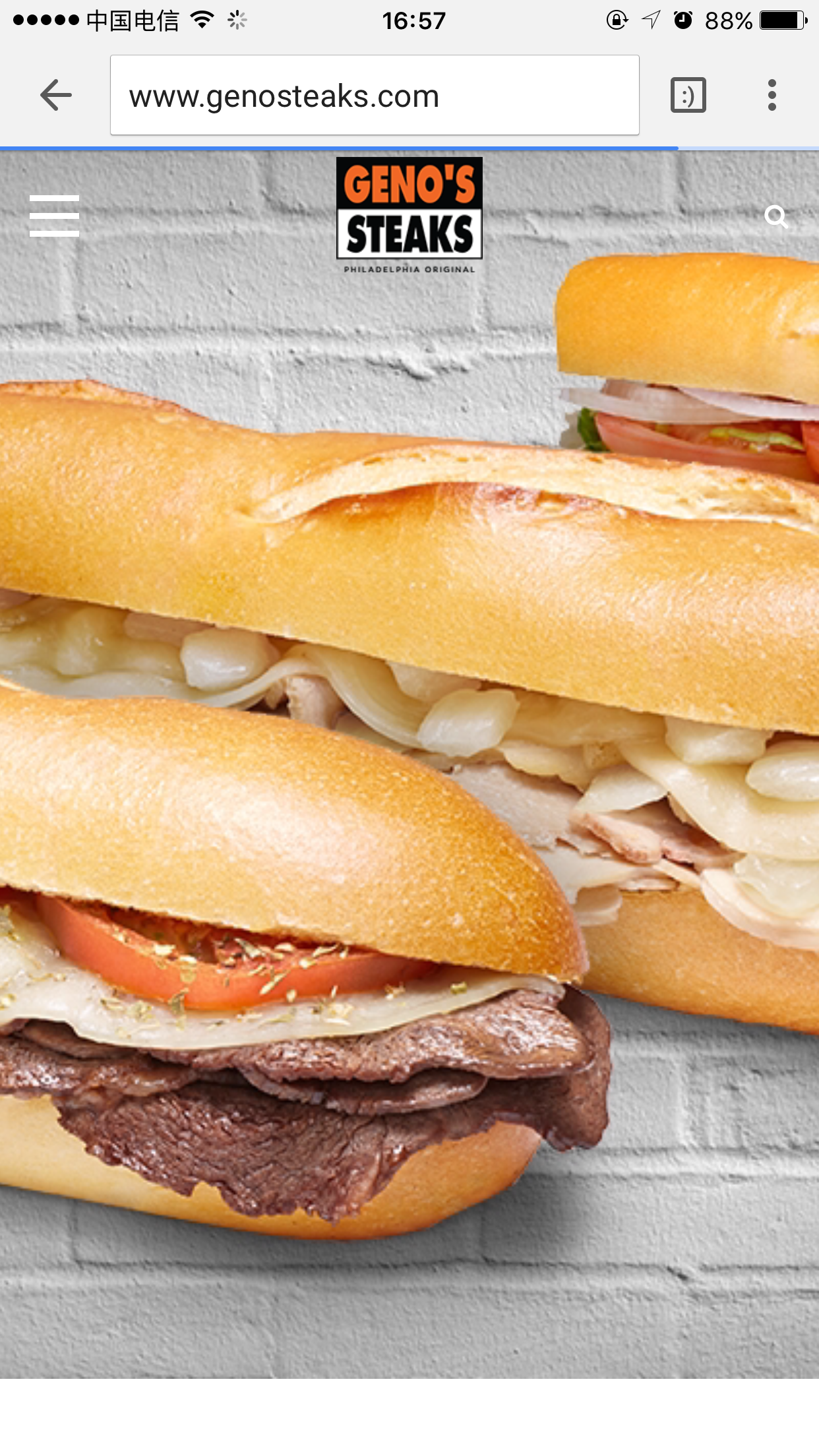
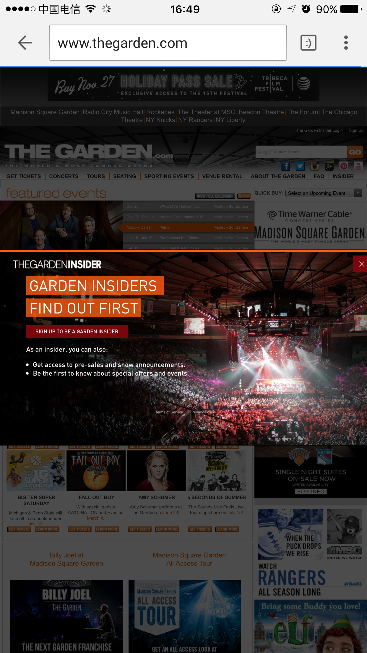
As mentioned before, the most important thing of web app design is users. Your purpose is to satisfy your user needs, give them what they want. The following apps failed to be thoughtful towards users, thus made users quite confused. For example: IRCTC has way too many irrelevant contents; Geno steaks put no content but a big image on their first part; and MSG has a pop-up ad, which made customers difficult to close it since phone screen is already smaller then PC screen.
Indian Railway Catering and Tourism Corporation
Geno steaks
One of the most famous Philadelphia cheesesteak restaurant.
Madison Square Garden - Official Web Site
Indoor stadium in the heart of New York City, refered as “The World’s Most Famous Arena”
The “Unthoughtful” web app award goes to: Indian Railway Catering and Tourism Corporation.
They claimed themselves to be “Next Generation eTicketing System” but on the fist glance I cannot even find “eTicketing”. How frustrated would I be if I really need to book a ticket now.
The life achievement award: Arngren Electronics (An Norwegian electronics shop)
I need to take my half a day off after seeing this. Reason: sick leave. Eyes are hurt.
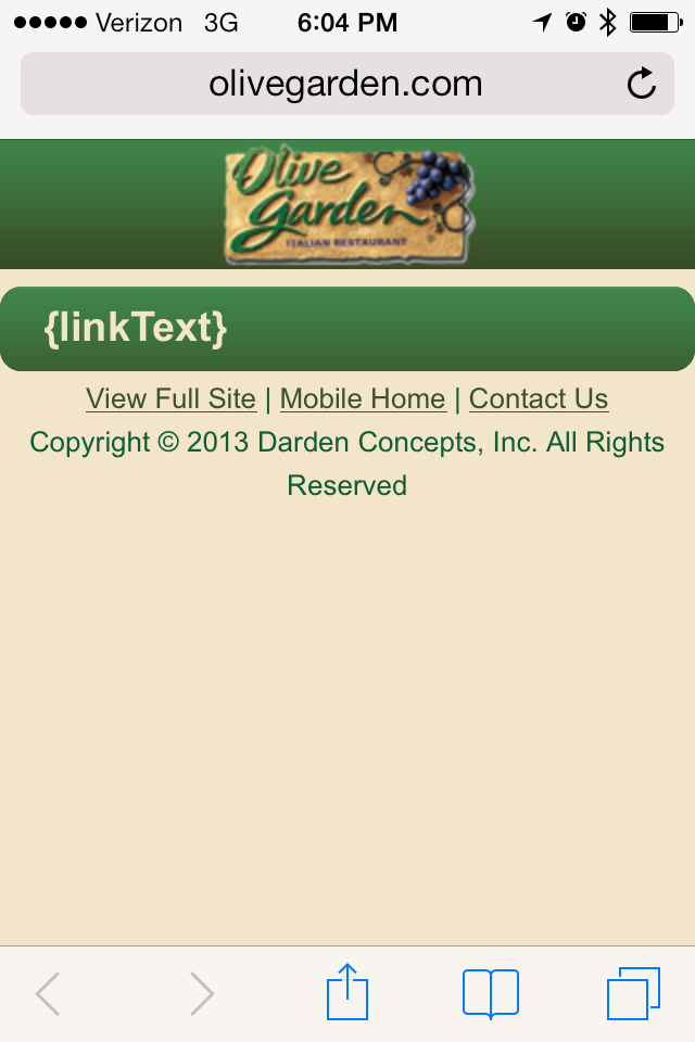
The Razzie Redeemer Award: Olive Garden (an American casual dining restaurant chain specializing in Italian-American cuisine)
Kudos to Olive Garden. They used to look like this and clearly they put some thought on fixing it.
Before:
After:
